The problem
Medication compliance is a stubborn public health problem. When people do not take their medicine as directed, the treatment underperforms and the money spent on it is wasted. The failure is rarely a refusal — it is a scatter of small everyday frictions, and those are designable.
What "on time" actually means
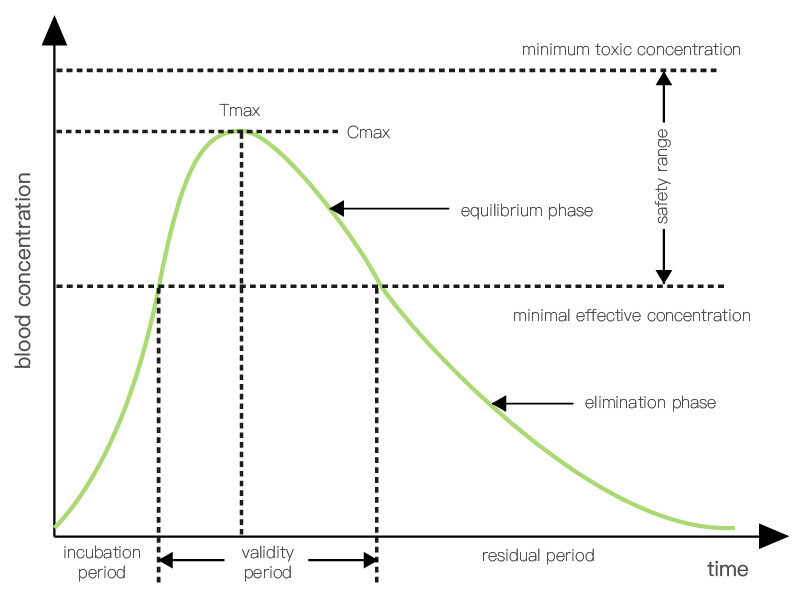
Everything in this project follows from one graph. After an oral dose, the drug's concentration in the blood rises, peaks, and decays; it is useful only while it sits inside a certain range. Reading that curve for different dosing intervals shows what keeps concentration in range and what does not.
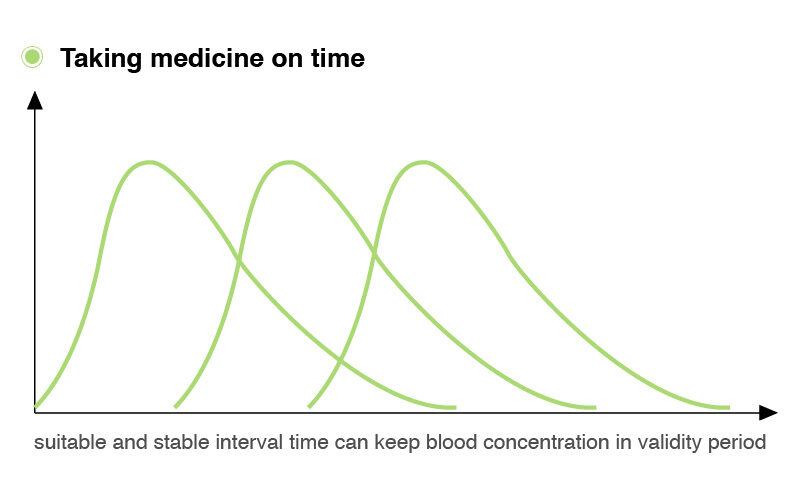
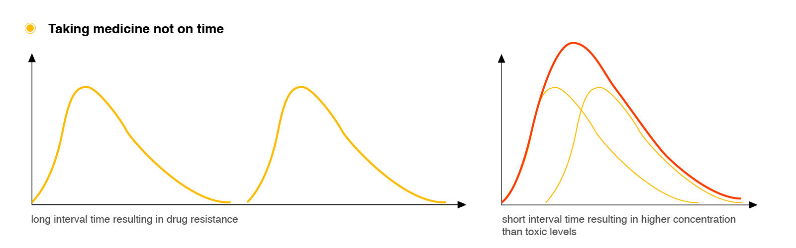
So taking medicine on time is not taking it at the same clock time every day — it is keeping a stable interval between doses. That distinction is invisible on most packaging, and it is the principle the whole product is built on.
Where it goes wrong

It is inconvenient. The instructions on a medicine box are hard to find and written for clinicians. Holding the dosages of several different medicines in your head at once is genuinely difficult.
People forget. They forget the dose, they forget where they put the box, they forget to refill it, and they forget to pack it when they travel. Refilling costs a trip and a wait.
Motivation runs out. Some people have not forgotten at all. Taking a pill is a daily reminder of being a patient, and when the medicine is preventive its benefit is invisible, so the habit quietly lapses.
Who it is for



From goals to a system
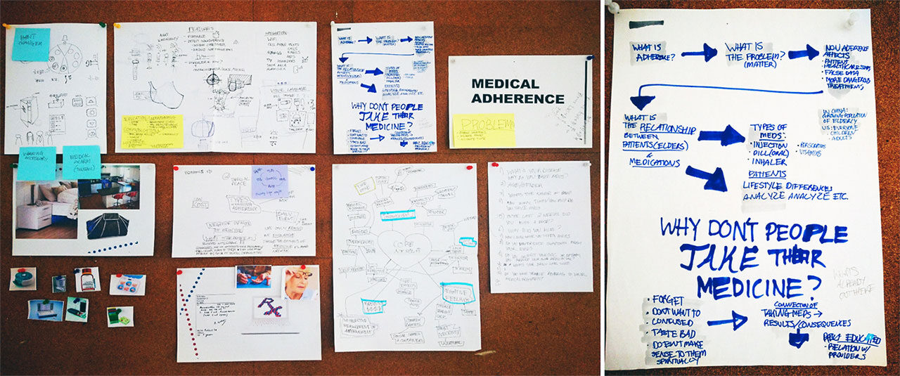
Three goals came out of the research — simplify the management, make the information visual instead of textual, and give people a reason to keep going — and each mapped to a decision:
- Sort by dose, not by drug. The pharmacy pre-sorts everything a person takes at one moment into a single sachet, following the model PillPack uses. Nothing is left for the patient to assemble.
- Redesign the packaging and what is printed on it, so the necessary information can be read at a glance.
- Remind at the right moment, physically as well as on a phone.
- Keep a record, so the person — and, if they want, a clinician or a carer — can see what actually happened.
Packaging
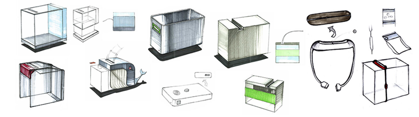
I worked through four packaging routes before settling on one.
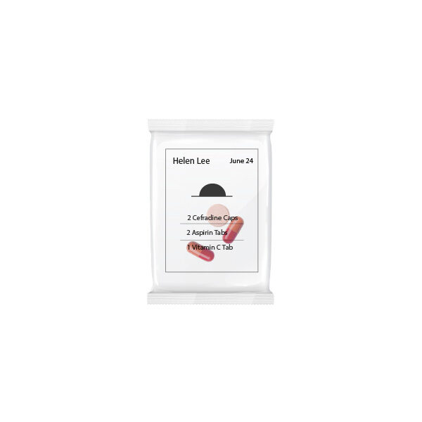
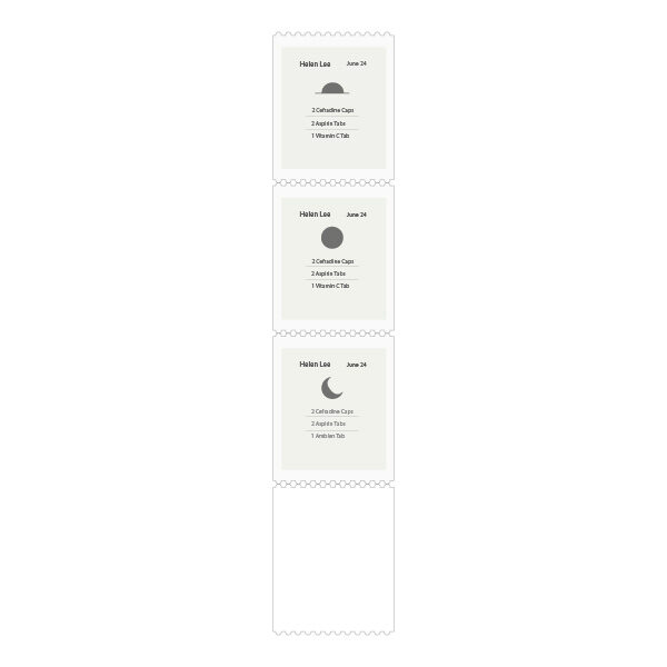
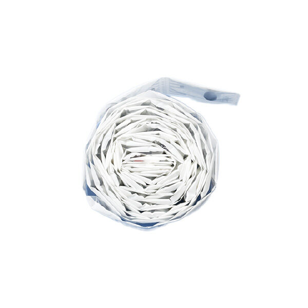
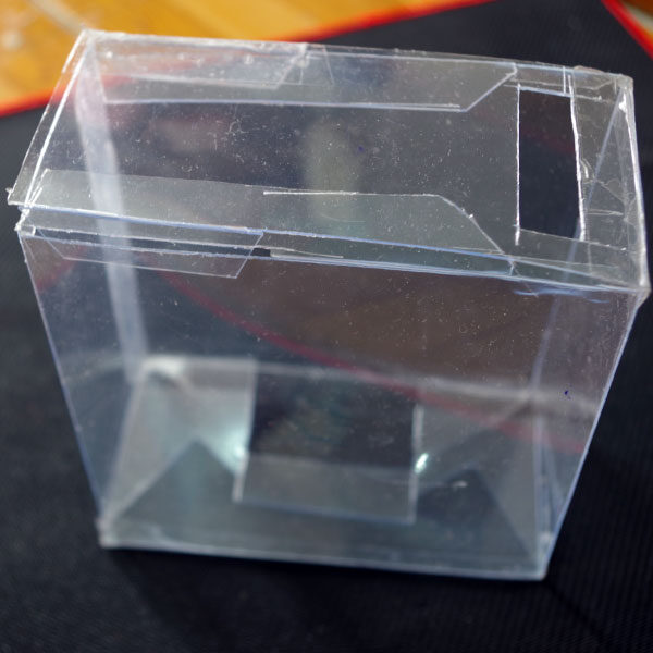
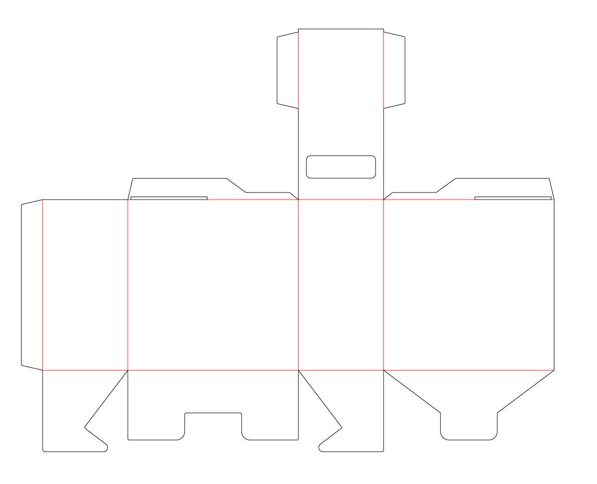
The uniform package is what the rest of the system stands on. One standard sachet that a pharmacy can fill and a machine can handle turns a mechanical problem into a tractable one, and it means the box does not have to know anything about the shape of the pills inside it.
What is printed on the pack
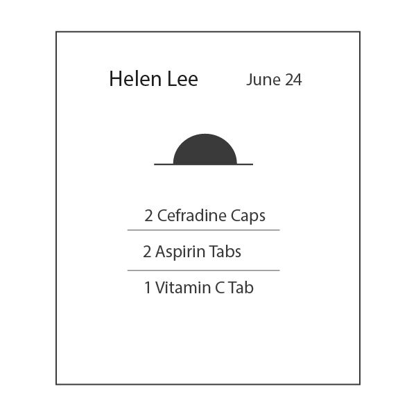

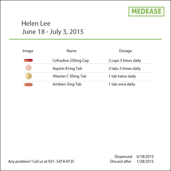
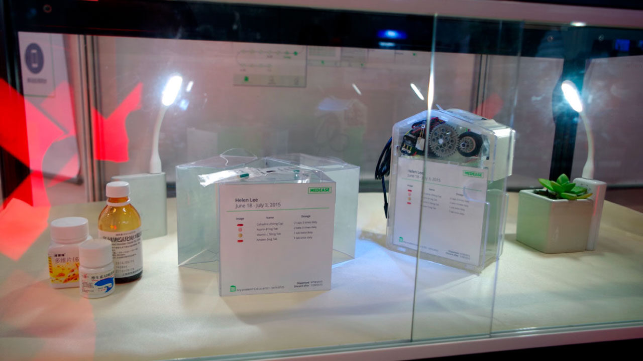
Each sachet carries the name, date, time, pills and dosage. Time is one of four icons rather than a printed hour, because people's days differ: printing "8:00" is wrong for anyone whose morning starts later and misleading for everyone else, when what the medicine needs is a consistent gap rather than a particular hour.
The pills themselves are shown as pictures. Unlike a conventional medicine box, you do not have to read anything to know what you are holding.

The system around the box
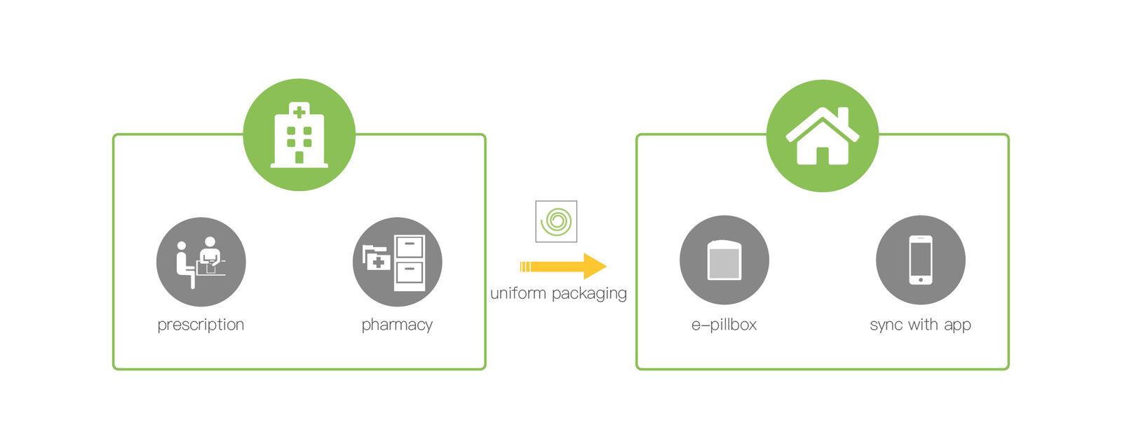
The device is one part of a chain that starts at the prescription:
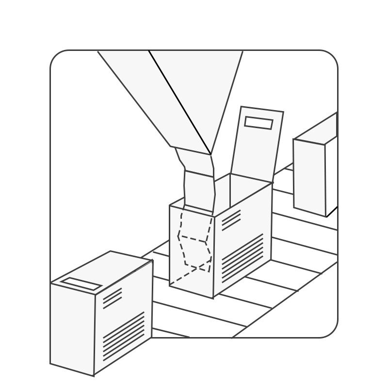
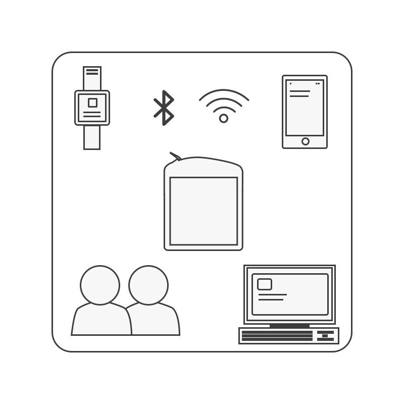
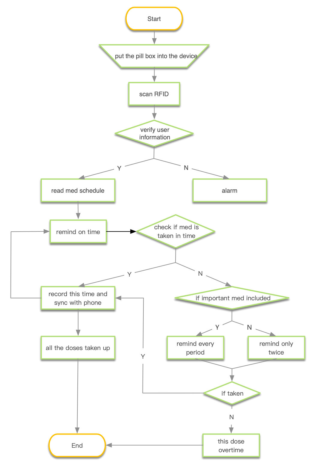
- The pharmacy pre-sorts the prescription into uniform packs; the schedule travels with them on an RFID tag.
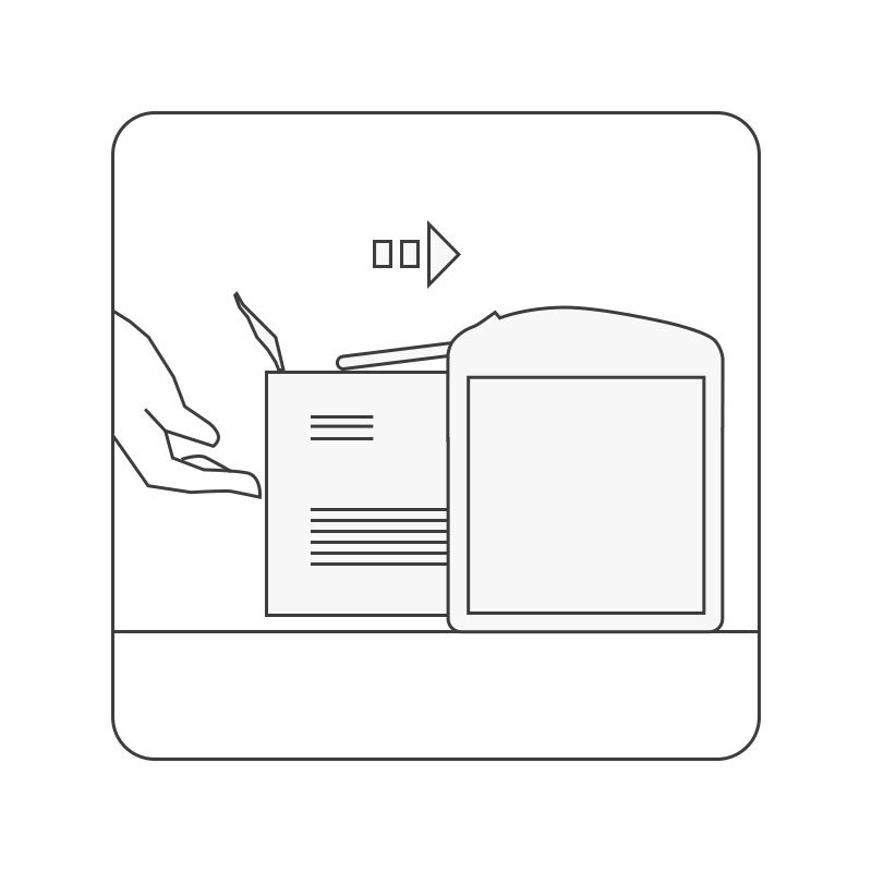
- The packs go into the box, which checks identity and reads the schedule.
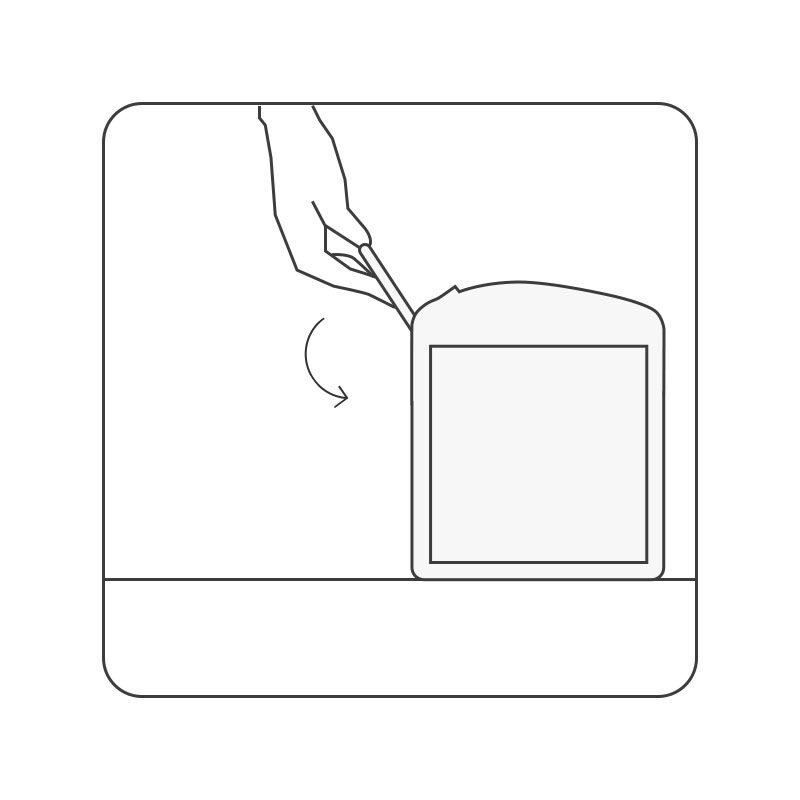
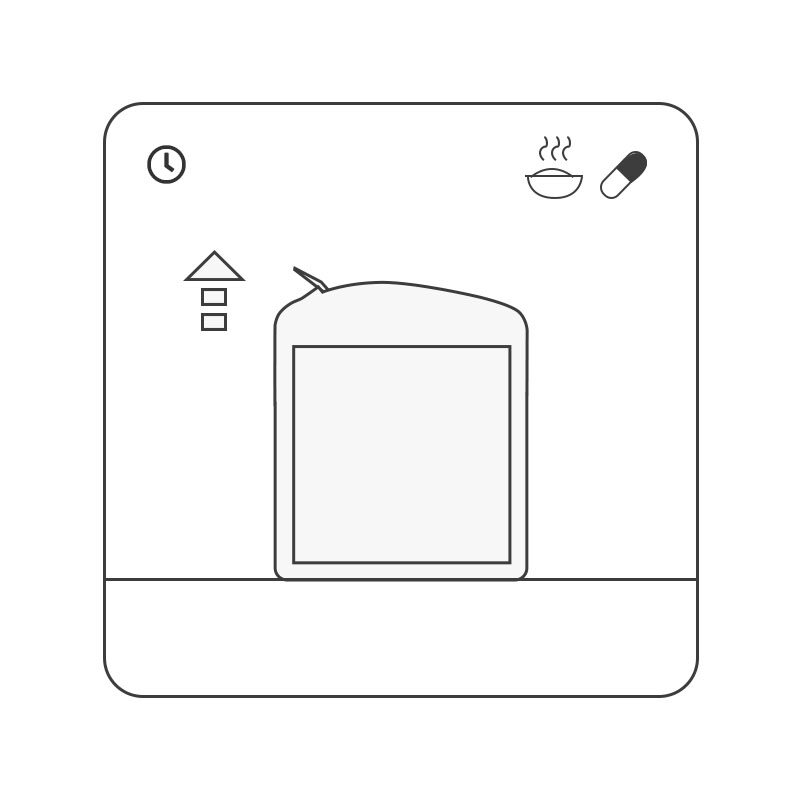
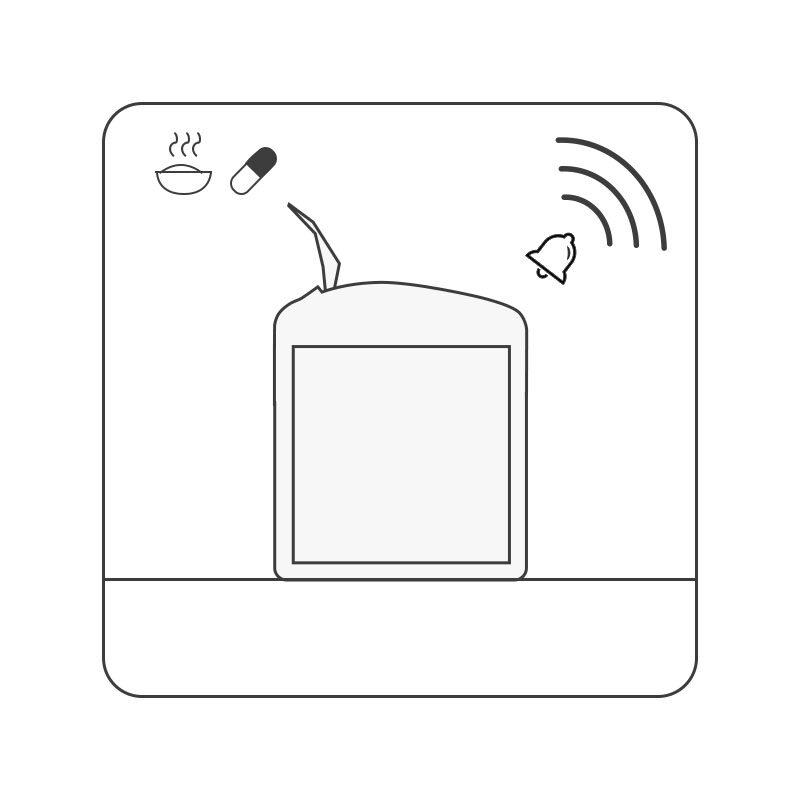
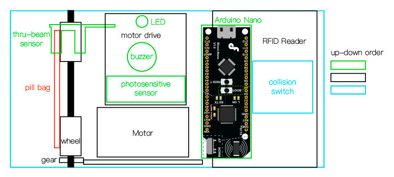
- At dose time one pack moves up on its own, with a light and an alarm.
- The record syncs over Wi-Fi or Bluetooth to a phone or watch, where a clinician or carer can see it if the person wants them to.
Product and app
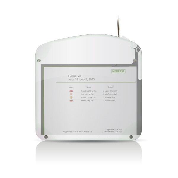
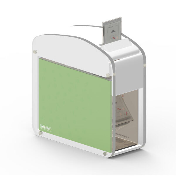
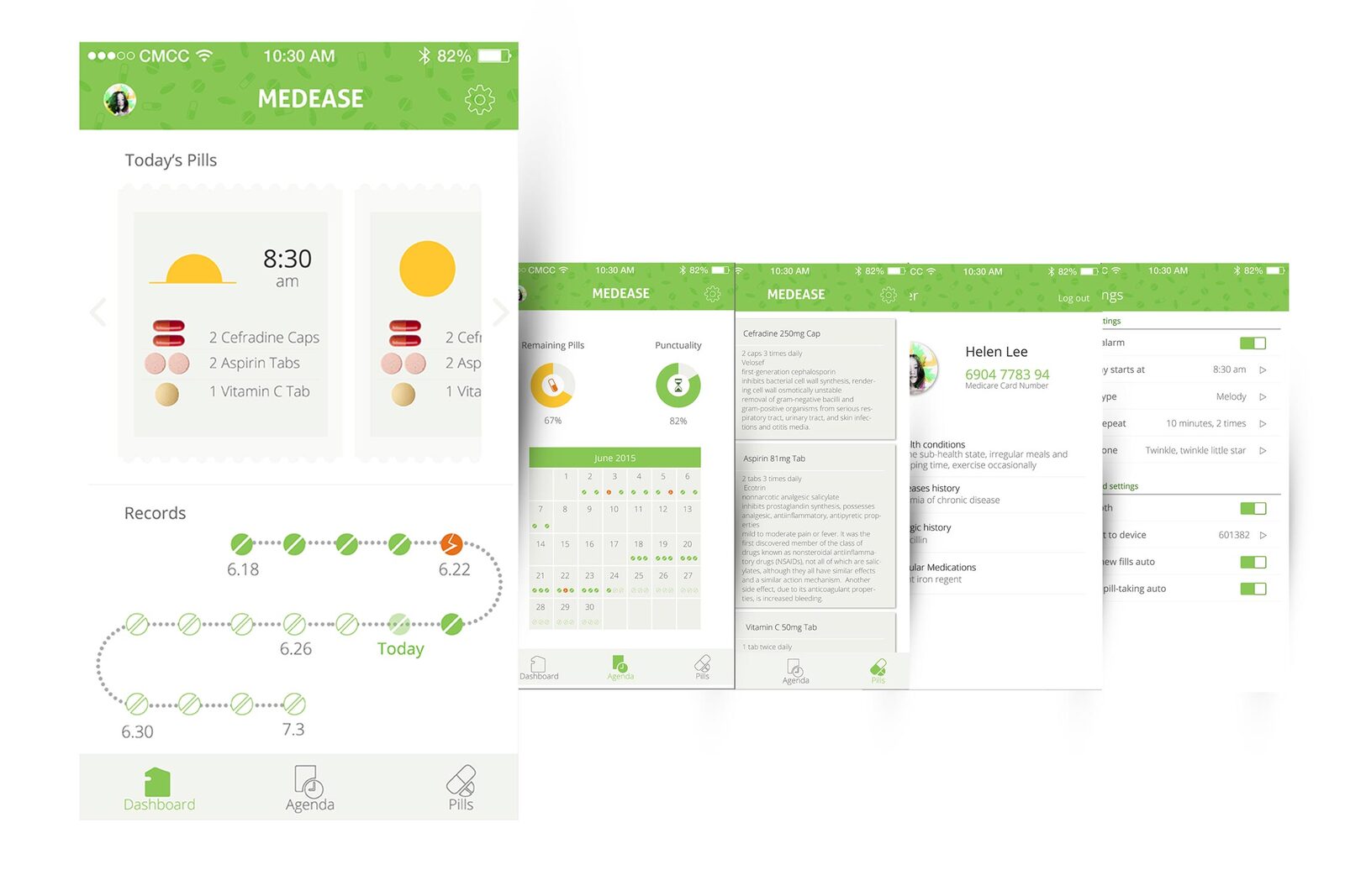
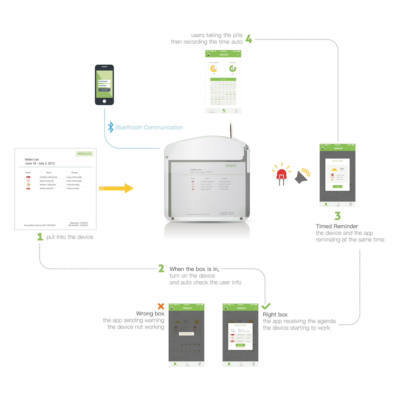
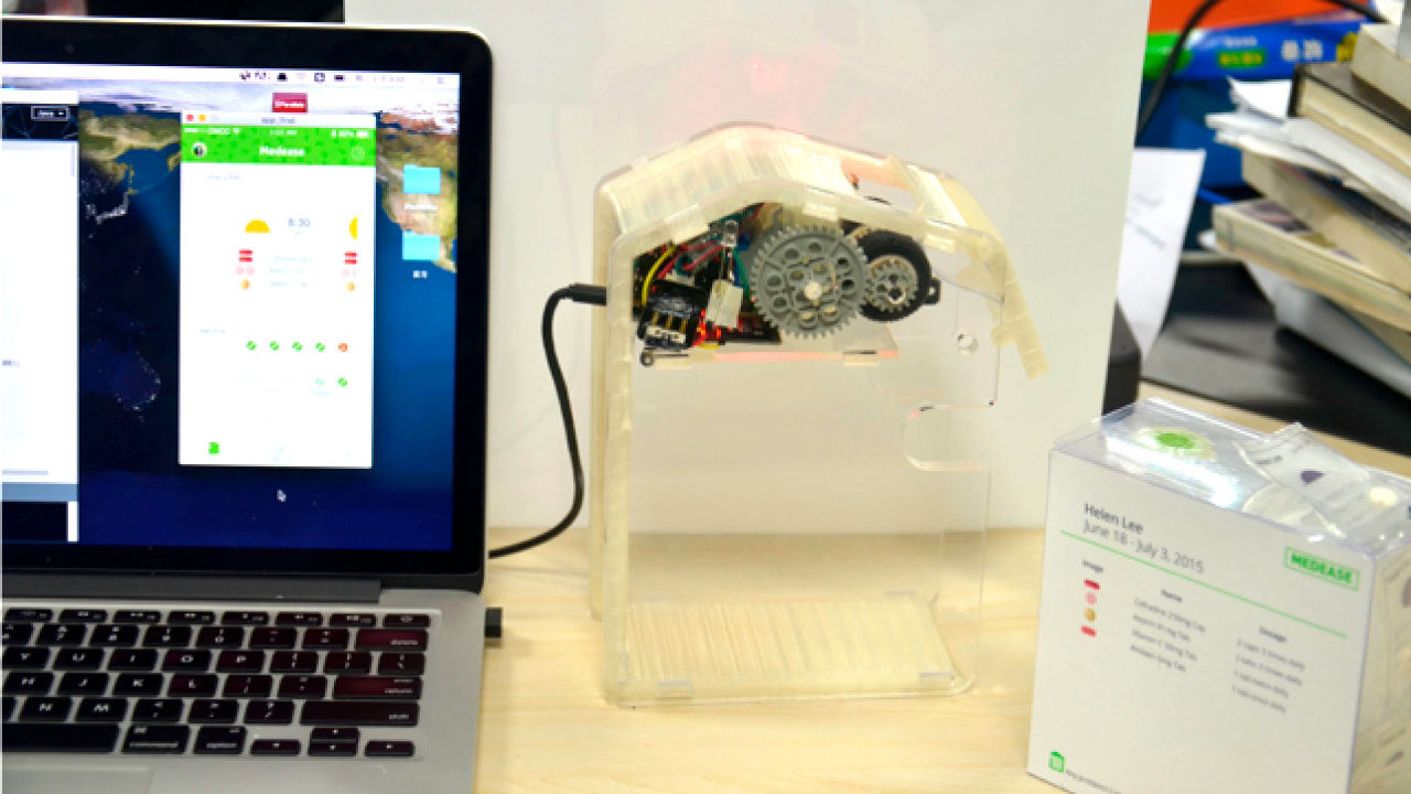
The app carries four things: the schedule, the record of what was taken, the timed reminder, and the information about each medicine — the same content as the sachet, kept somewhere you can look it up.
Prototype
Where it went next
The team at the SJTU Interaction Design Lab carried the concept further. They kept the core idea — uniform packaging, sorted by dose, with the schedule travelling on the pack — and replaced the mechanical feed with a non-mechanical solution, putting more work into the structure and moving the interface onto an e-ink screen.