Selected work

Interface & visual design

Design work from before the PhD, and alongside it: an enterprise platform for a dealer network, operational dashboards, e-commerce and corporate sites, identity and print. Dense data at one end, brand at the other.

Product UI · Web application

Sensor monitoring console

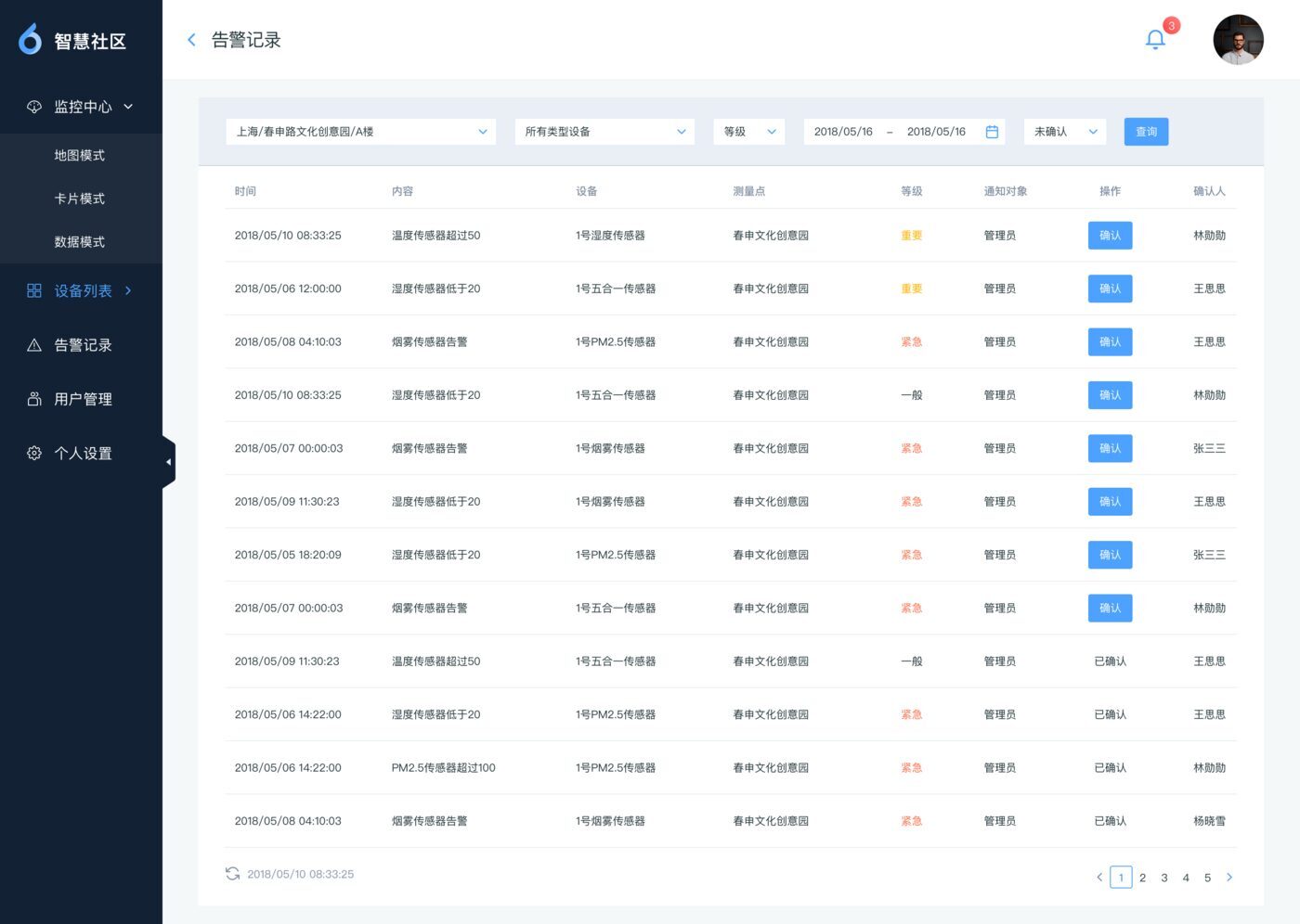
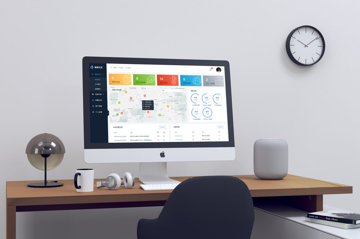
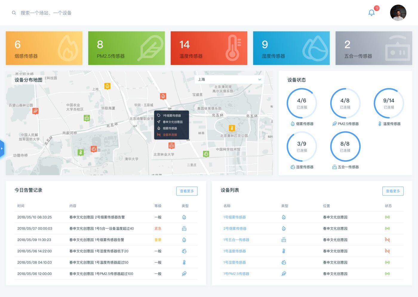
A console for a building sensor network — smoke, PM2.5, temperature, humidity and combined units across many sites. The home view answers the only question an operator has on opening it: what is wrong and where. Counts by sensor type across the top, a map with the sites plotted, connection status per type as a ratio rather than a percentage, and today's alarms as a list you can read without clicking.

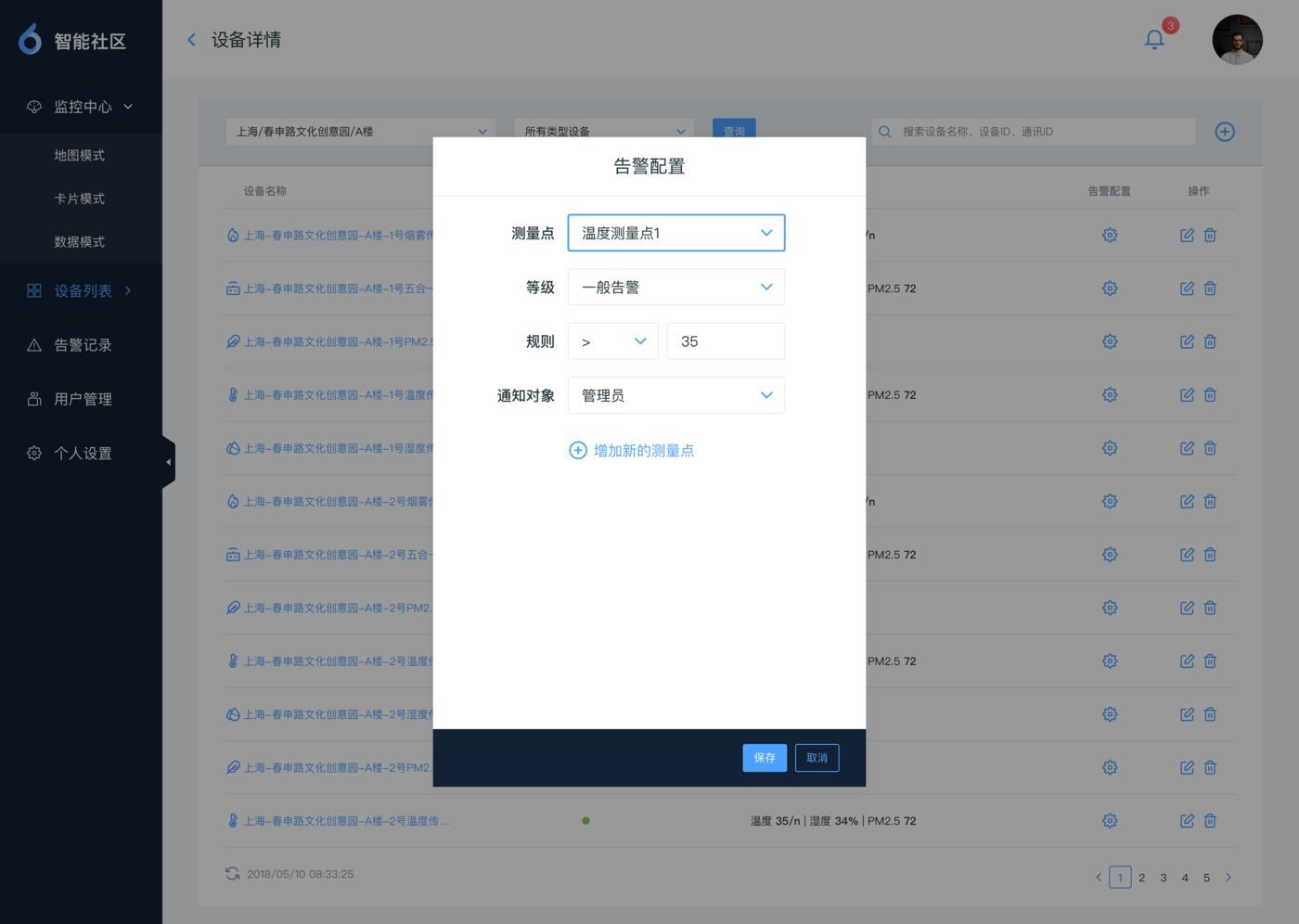
Behind it sits the unglamorous half: device, customer, user and user-group management, and an alert-rule editor, all built on one table-and-form pattern so that learning one screen teaches you the rest.
Dashboard Data density Admin flows IoT
Monitoring dashboard: colored counts for five sensor types, a map of device locations, connection-status rings, an alarm log and a device list.
Operator home view.
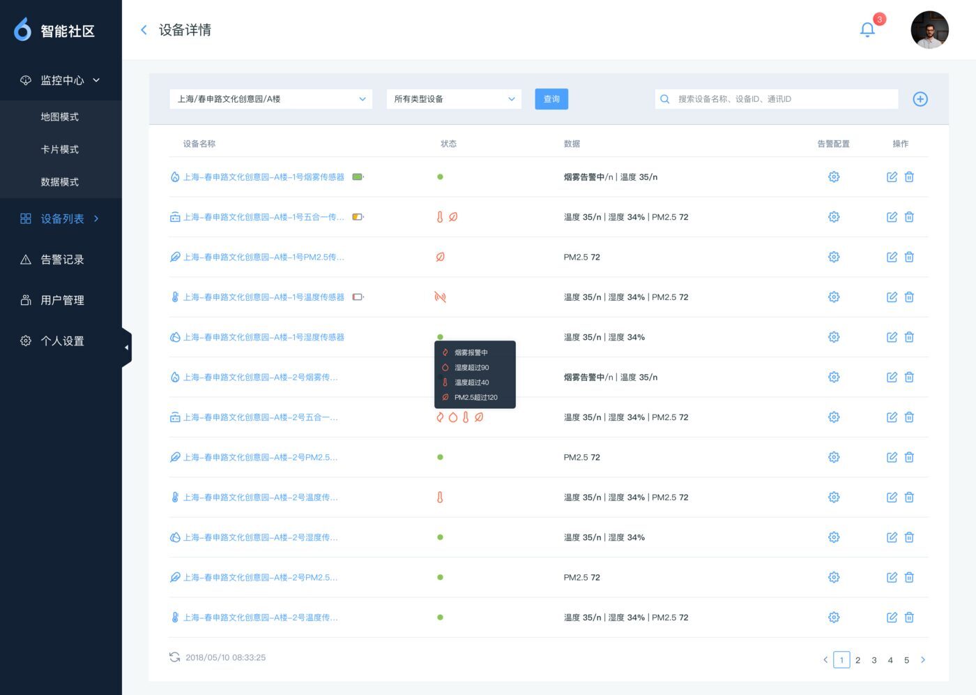
Device list screen with filters and per-device status.
Device list.
Alarm records screen with time, content, severity and type columns.
Alarm records.
Alert rule editor with threshold and notification settings.
Alert-rule editor.
The console shown on a desktop monitor in an office setting.
In place.

Product UI · Web and mobile

Cadillac dealer platform

An online platform for a car brand's sales department and its dealer network, replacing a set of processes that ran on emailed spreadsheets and paper checklists. It does three things: it lets dealers see and trade each other's advanced-stock-age cars, it manages everyday sales information across four roles, and it makes the POSM inspection paperless.

Four roles use the same data from different angles — head office, area managers, dealers, and sales staff — so the design question throughout was less about screens than about who sees what, and who is allowed to change it.
Enterprise platform Four user roles Data density Field audit tool Web + mobile

See the original presentation (PDF, 8 pages) →

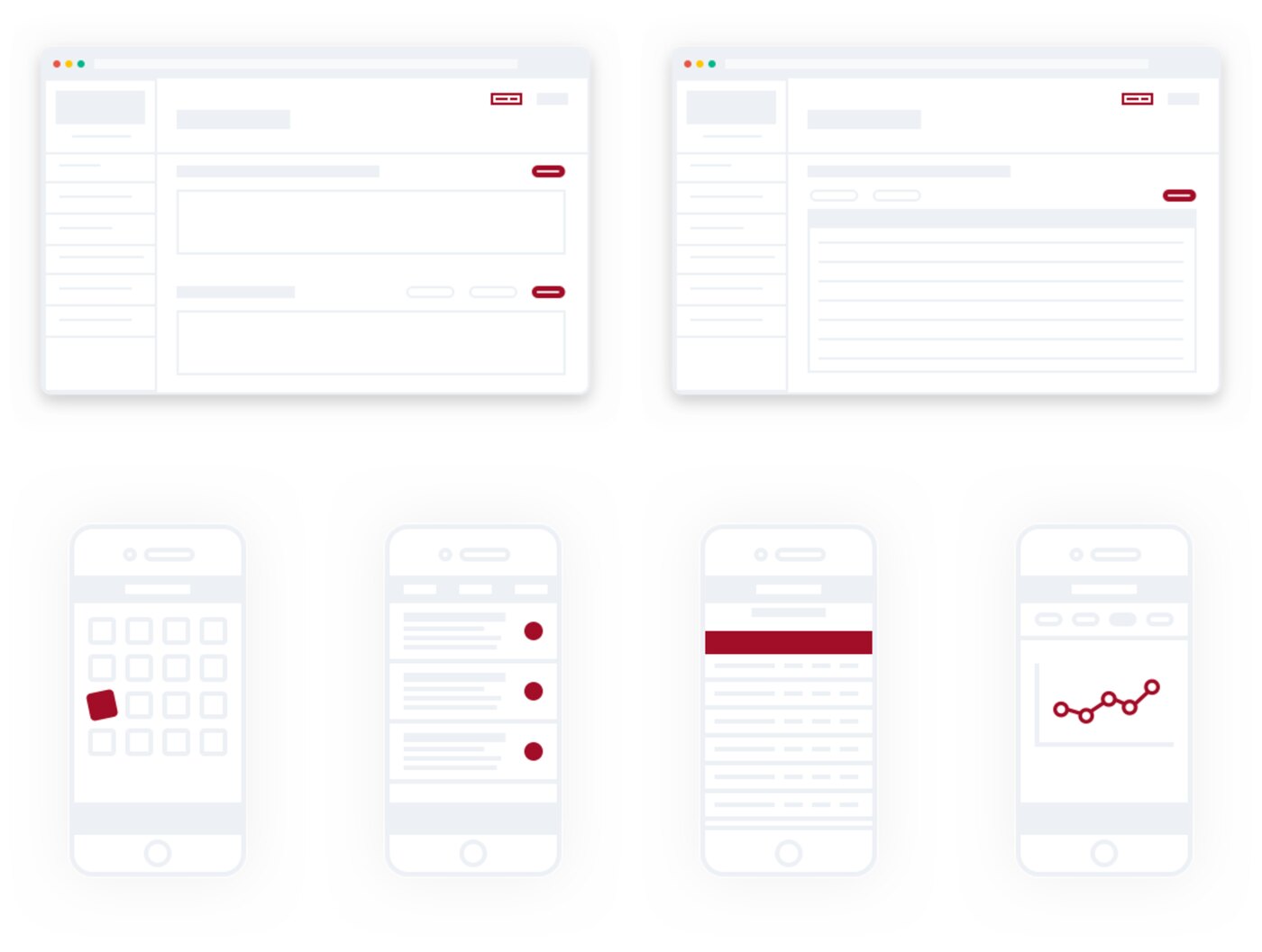
Greyscale wireframes: two web page layouts above a row of four phone screens.
Wireframes, before any of the below.

01  Advanced-stock-age cars

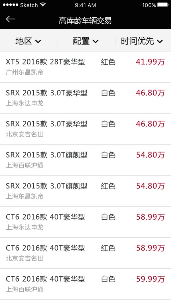
Cars that have sat too long in one dealer's warehouse are worth something to a dealer somewhere else. Head office maintains the stock information on the desktop and chooses which dealers a car is visible to; dealers browse and request; area managers accept or reject those requests from their phone.
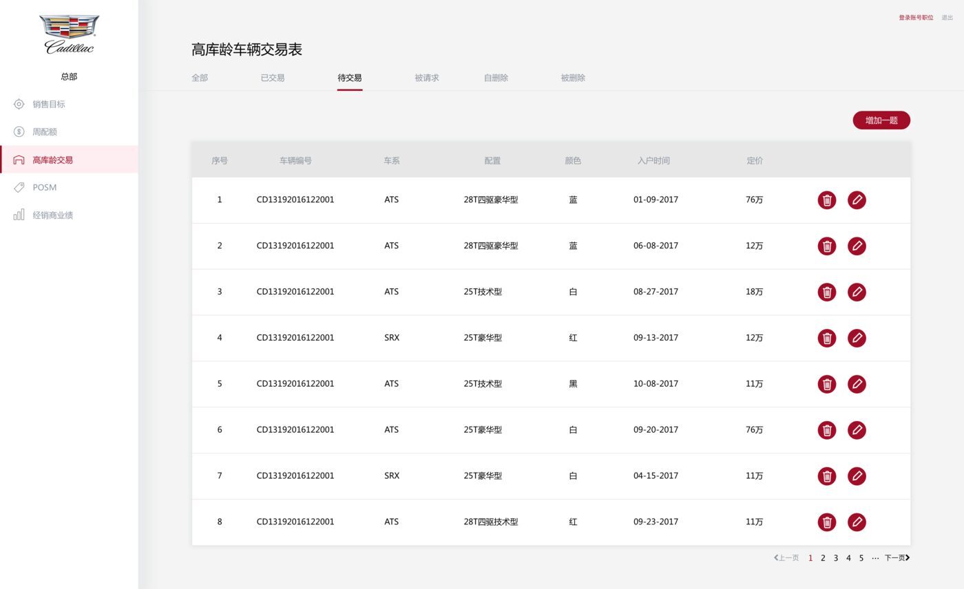
Aged inventory table at head office: vehicle ID, model, trim, color, stock date and price, with confirm and delete actions on each row.
Head office edits the stock list.
Aged inventory on a phone, filtered by region, trim and age, each row a car with color and price.
Dealers search and request.

02  Sales management

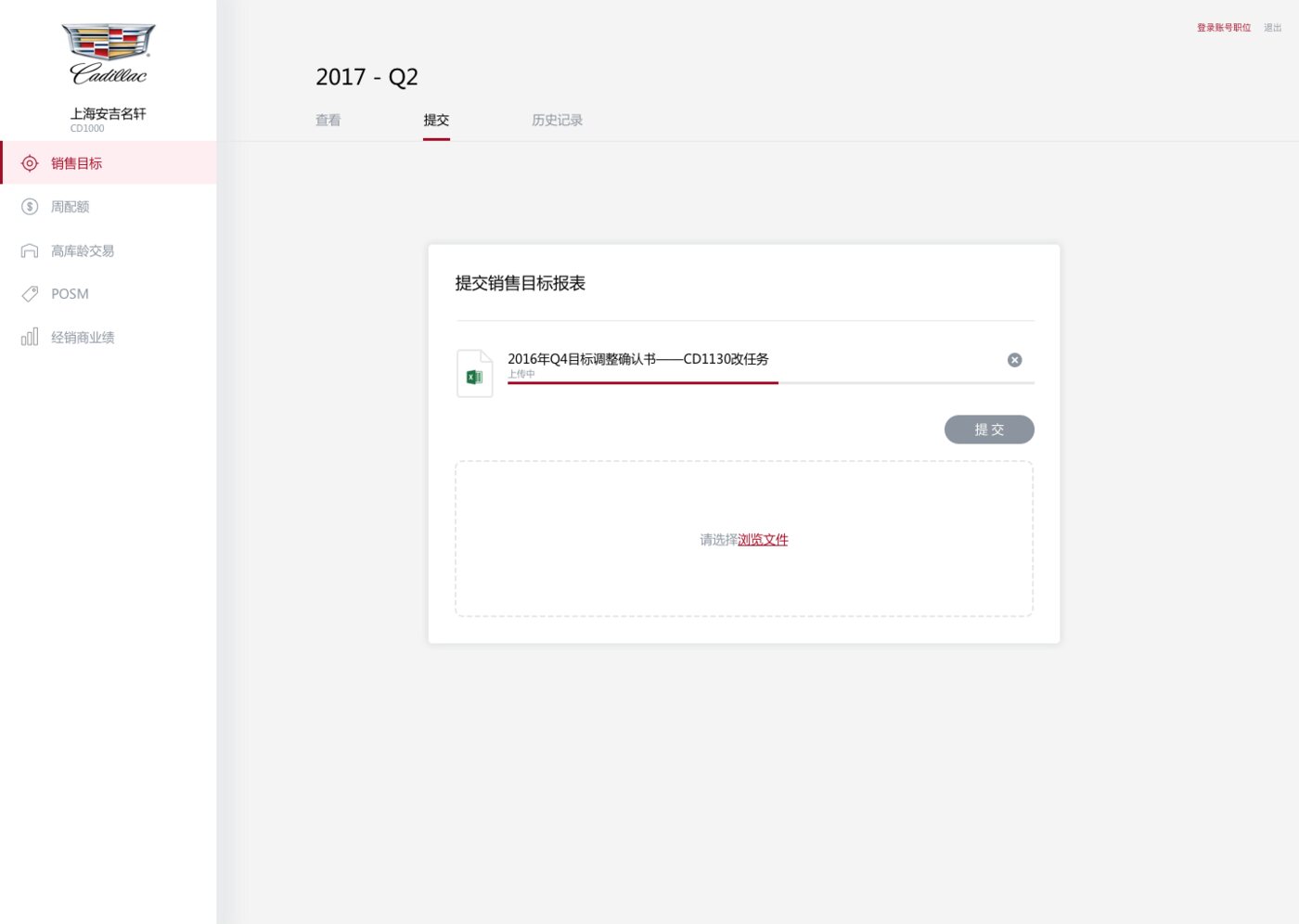
Head office used to send quarterly targets to dealers as Excel tables. The platform does not ask anyone to give that up: head office still uploads the spreadsheet it already makes, and everything after that — issuing it, watching who has responded, confirming each dealer's numbers — happens online. Changing the file format would have been the easy design decision and the one that got the tool rejected.
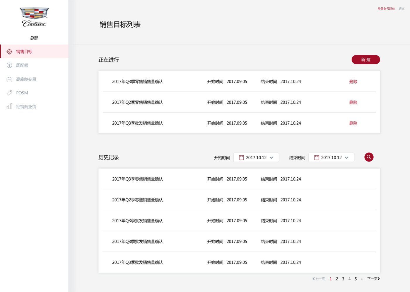
Sales target module: in-progress confirmation tasks with start and end dates above a searchable, paginated history.
Head office: upload and send the file.
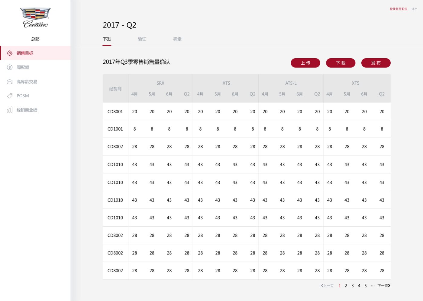
Quarterly target table: dealer codes down the side, four car models across the top, each split into three months and a quarter total.
Dealers × models × months, with quarter totals.
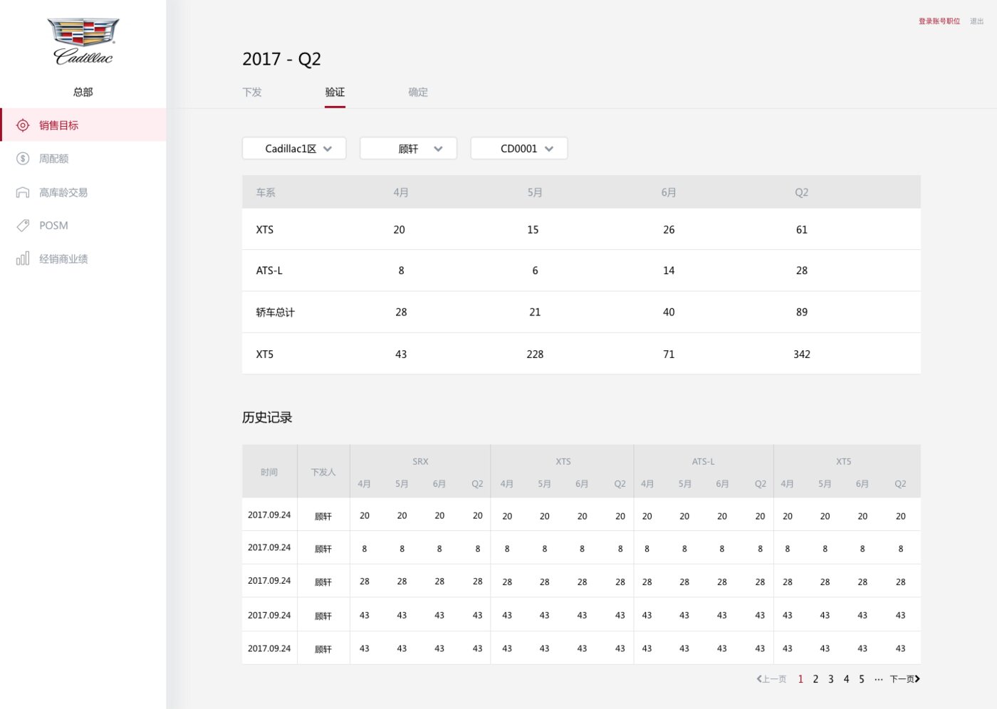
Verification step: region, staff and dealer filters above one dealer's figures, with the full issuing history below.
Check who has responded, then confirm each dealer.
Dealer-side submission: an attached target adjustment document ready to send, above a drop area for browsing another file.
Dealers: upload, submit, check status.

The target table is the screen the rest exists to serve. It holds four models against three months and a quarter total for every dealer in a region, and has to stay readable and editable at once — so the visual weight goes almost entirely into the column grouping, and nothing else on the page competes with it.

On the phone the same module is built for sales people to scan rather than study, with an edit mode kept one tap away for the corrections that happen away from a desk. Area managers see their own region; head office sees all of it.
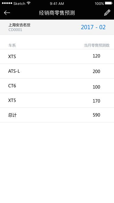
Monthly retail forecast per car model with a total row.
Retail forecast.
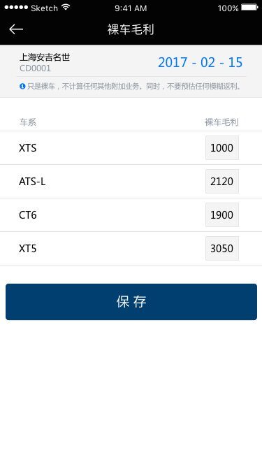
Editable gross margin figures per model, with a save button and an inline note about what the figure excludes.
Edit mode, one tap away.
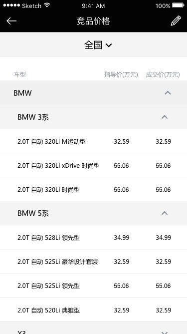
Competitor pricing grouped by brand and series, expanded to show list and transaction prices.
Competitor pricing.

03  POSM management

Point-of-sale material inspections were a paper procedure. Head office writes the questionnaire on the desktop — one row per item, with its zone, its score weight, the written criteria and the reference photographs. Managers then score a dealer's showroom from their phone, and the dealer reads the result and uploads proof of the fix without anyone printing anything.
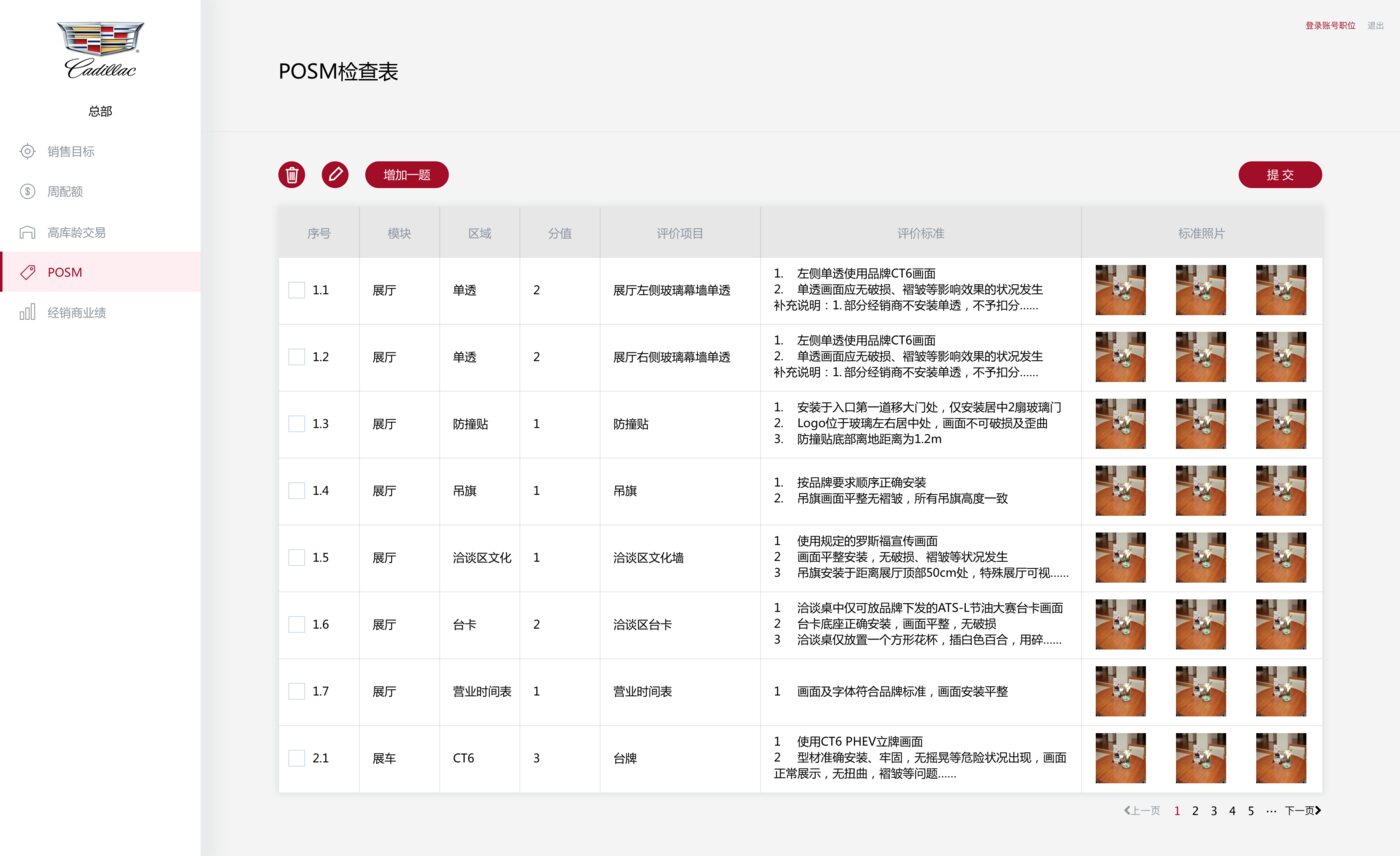
POSM questionnaire editor at head office: a table of inspection items with module, zone, points, criteria and a row of reference photographs each.
Head office writes the questionnaire.
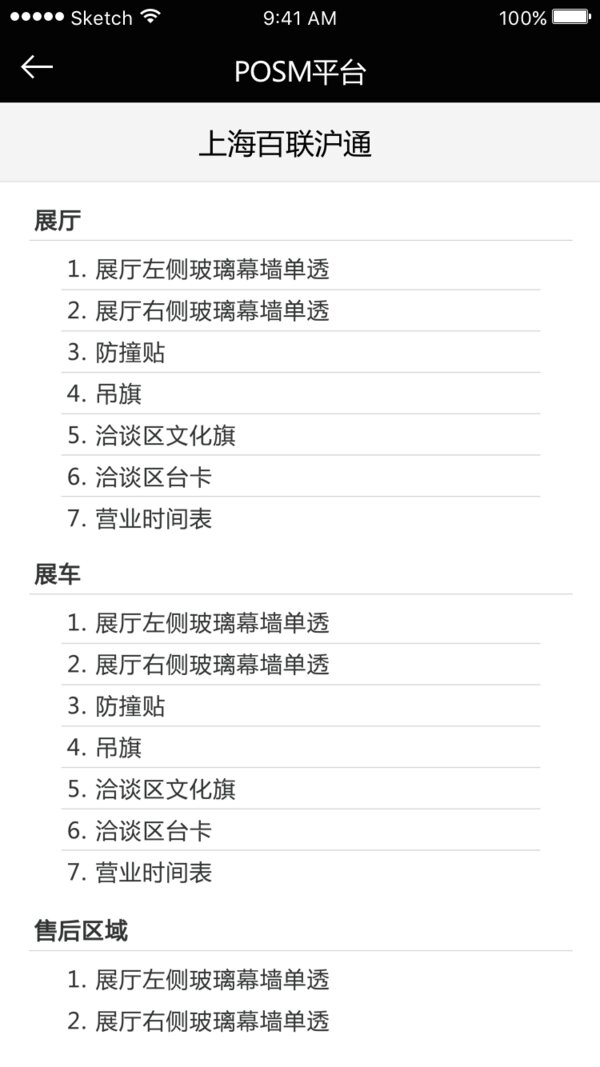
Audit checklist for one dealer, grouped into showroom, display cars and after-sales area, each with numbered items.
Checklist, grouped by zone.
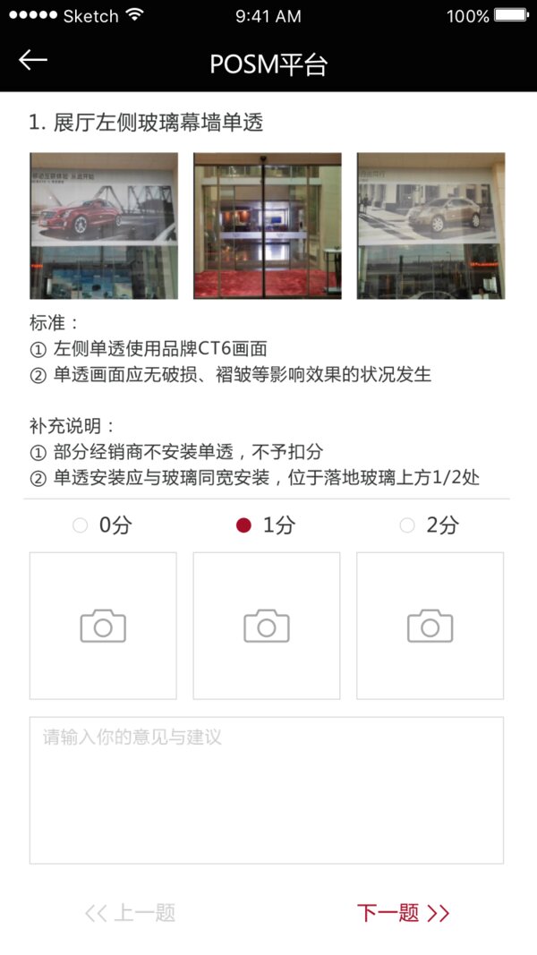
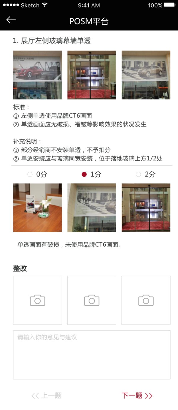
Scoring one item: reference photographs, the written standard and its exceptions, a three-point score, three camera slots and a comment field.
One item: standard, score, evidence.
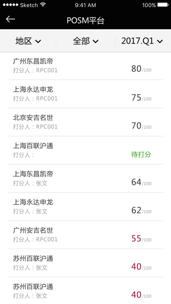
Scores by dealer for a quarter, out of 100, with one dealer still marked as awaiting scoring and low scores in red.
Scores by dealer and quarter.
Rectification view: the auditor's photographs and written finding, then empty camera slots for the dealer's proof of the fix.
The dealer photographs the fix.

An inspection score is a judgement someone has to defend later, so each item carries its reference photograph and written standard right next to the score, and the score is three points rather than a slider. The rectification screen reuses that layout with the roles reversed: the manager's evidence at the top, empty camera slots underneath for the dealer's.

E-commerce · Proposals and final site

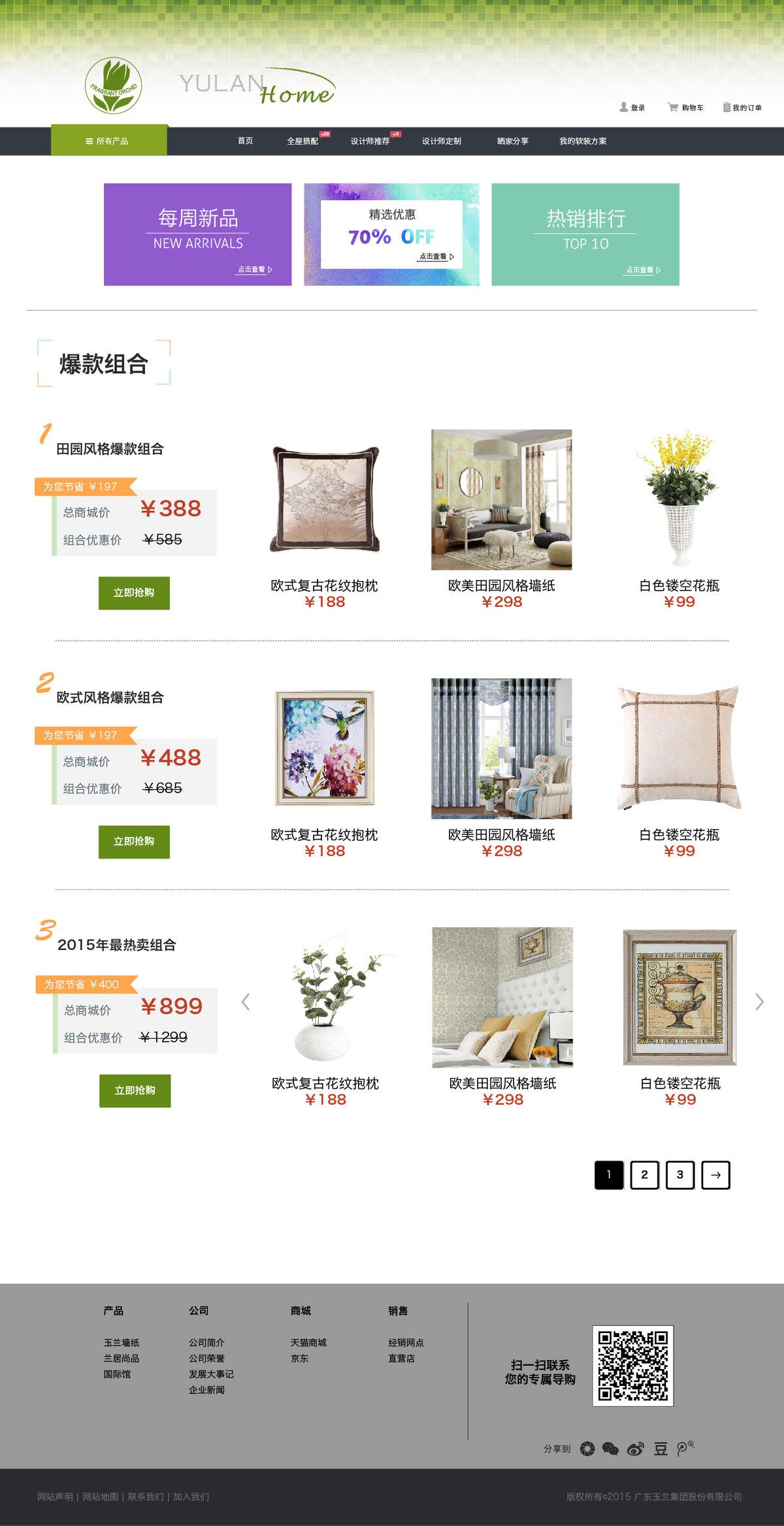
Yulan Home

A shop for wallpaper, fabric and home accessories, where nobody arrives knowing the product code they want. Three proposals went to the client, and the site that shipped is none of them — it takes the room-based browsing from the first, the stated service offer from the third, and puts a real catalogue behind both.

Web Retail Proposals to delivery Catalogue structure

The three proposals

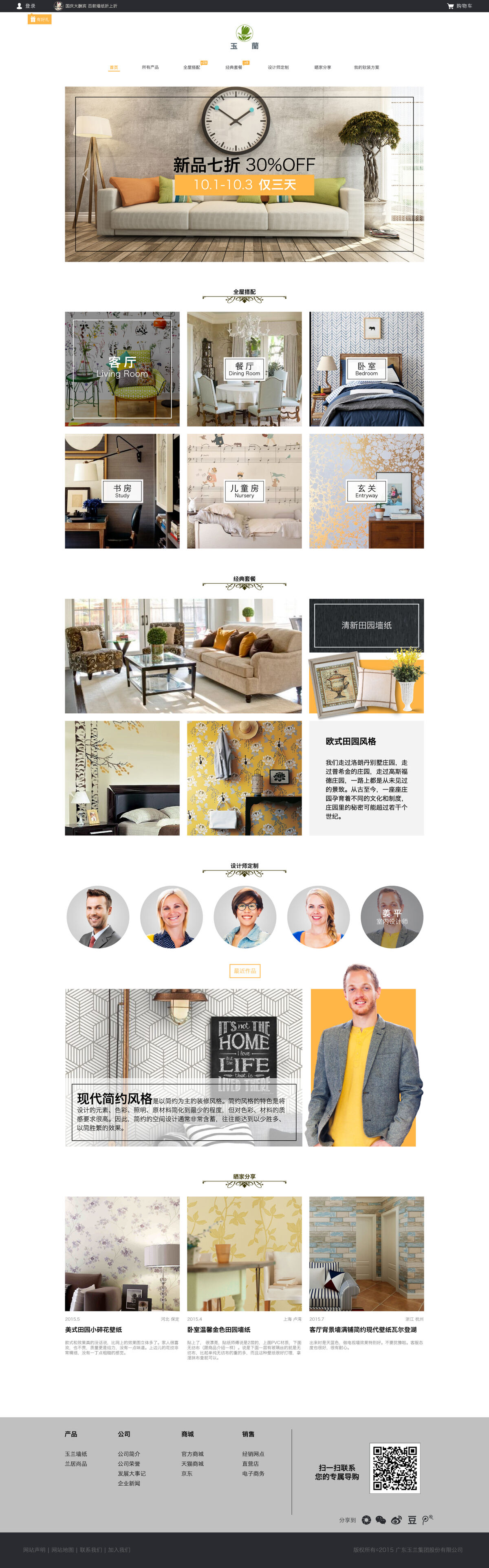
First proposal: a conventional shop with a photographic promotional hero, room tiles with framed labels, curated packages and a row of designer portraits.
One — the shop. Promotional hero, rooms as tiles, designers as faces. The safe answer, and the one that looks like every competitor.
Second proposal: pale paper background with hand-drawn line illustrations of an entryway, living room, bedroom, dining room, nursery and study, each with a short essay alongside.
Two — the magazine. Hand-drawn rooms and essay copy, one long scroll through a house, almost no product. Furthest from a shop and the most distinctive.
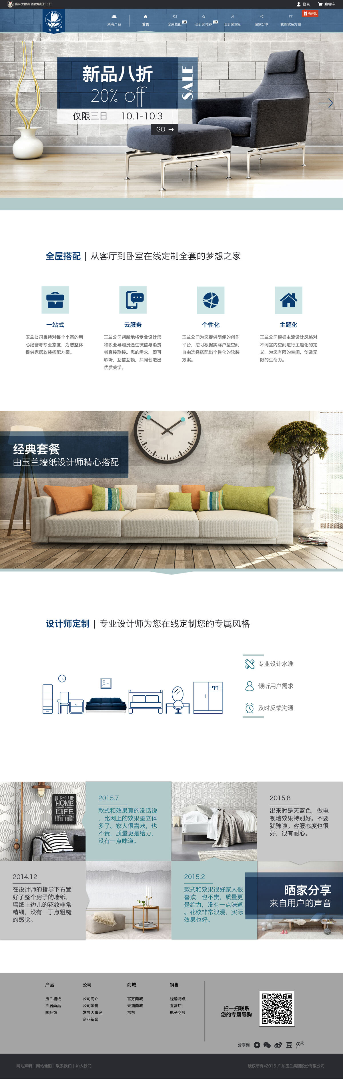
Third proposal: photographic hero, a four-icon row of service propositions, a classic packages band, designer customization, and dated customer stories.
Three — the service. The offer said out loud — one-stop, cloud, personalized, themed — with customer stories carrying the proof.

Putting three genuinely different answers on the table is worth more than three variations of one. The illustrated proposal was never going to ship for a business that sells by SKU, but it is the one that made the conversation about how the site should feel rather than which shade of green to use.

The final site

Nine page designs, delivered with a written spec — type sizes, image dimensions and interaction states for each page — so the build did not have to guess.
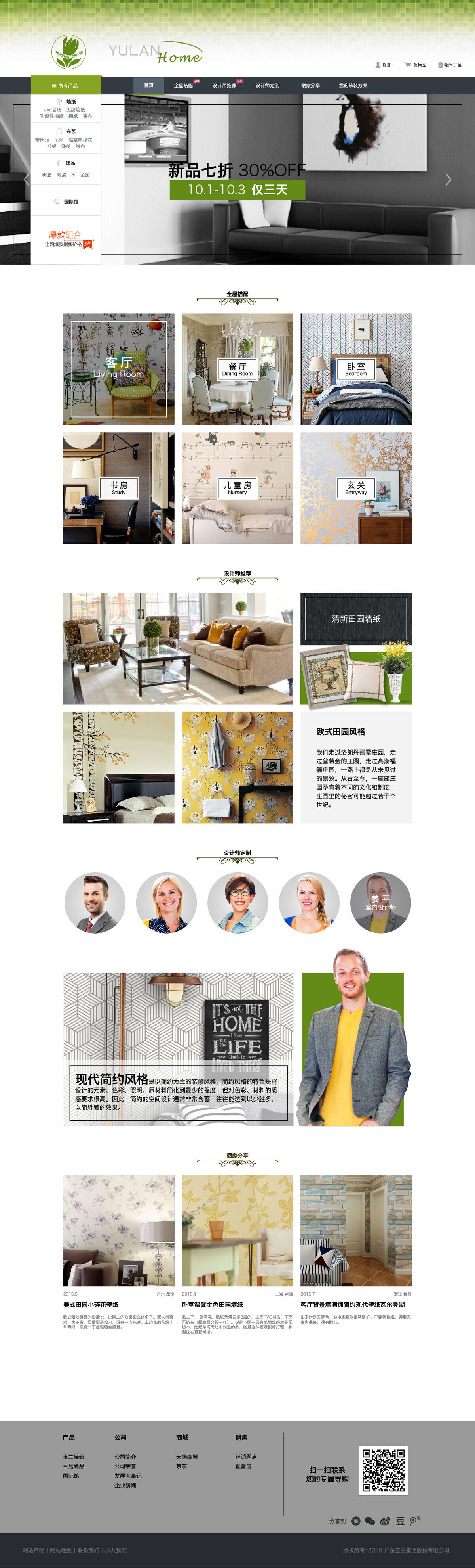
Home page: green Yulan Home identity, a persistent category menu over the hero, room tiles for living room, dining room, bedroom, study, nursery and entryway, then designer recommendations and style features.
Home. The category menu sits over the hero permanently, for the people who do know what they came for.
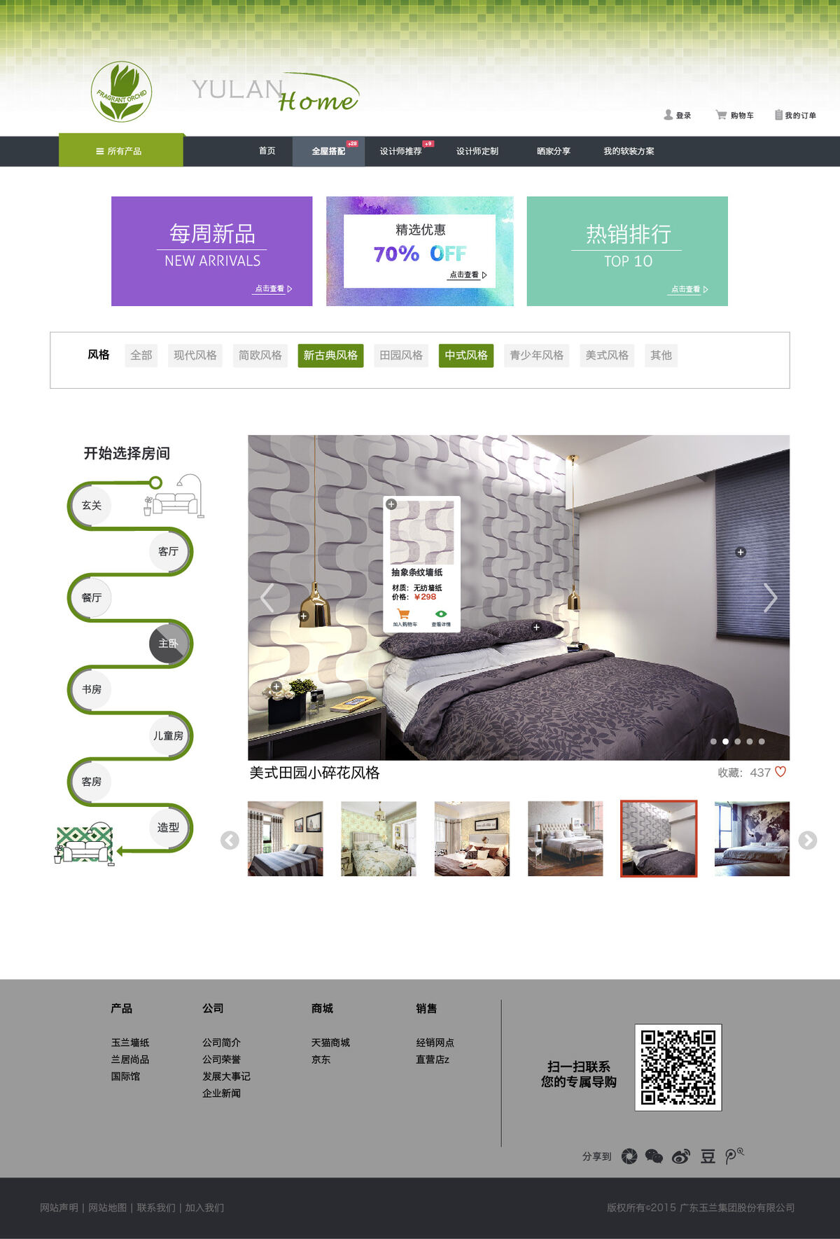
Whole-home matching: a vertical room-by-room path down the left from entryway to living room, dining room, bedroom, study, nursery and guest room, with a large room render and a hotspot card naming the wallpaper and its price.
Whole-home matching — walk the house room by room, and every surface in the render is a product you can price.
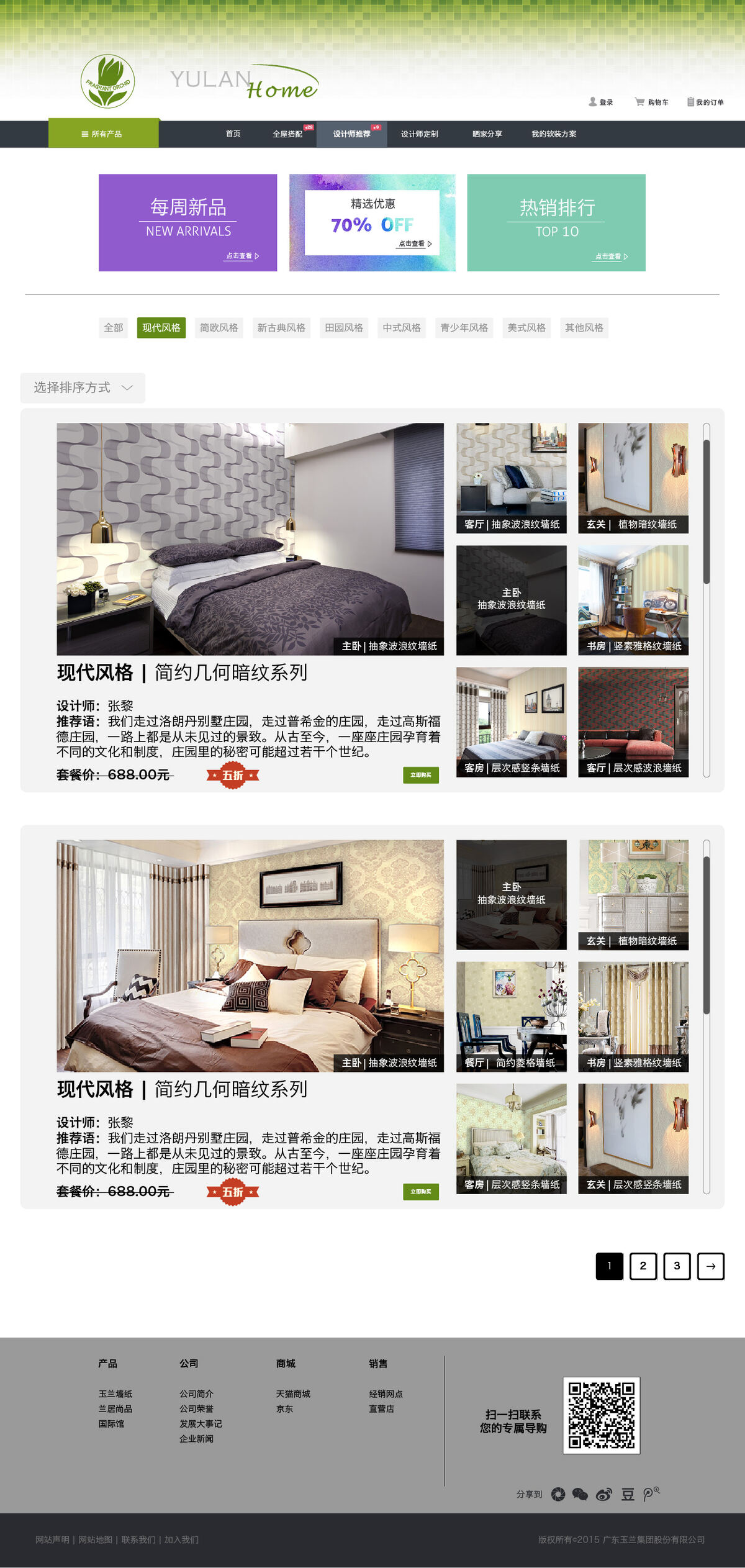
Designer recommendations: each scheme is a large room render beside a strip of the actual wallpapers used in it, with the designer's name, their note and a package price.
Designer schemes, each priced as a package and broken down into the papers that make it.
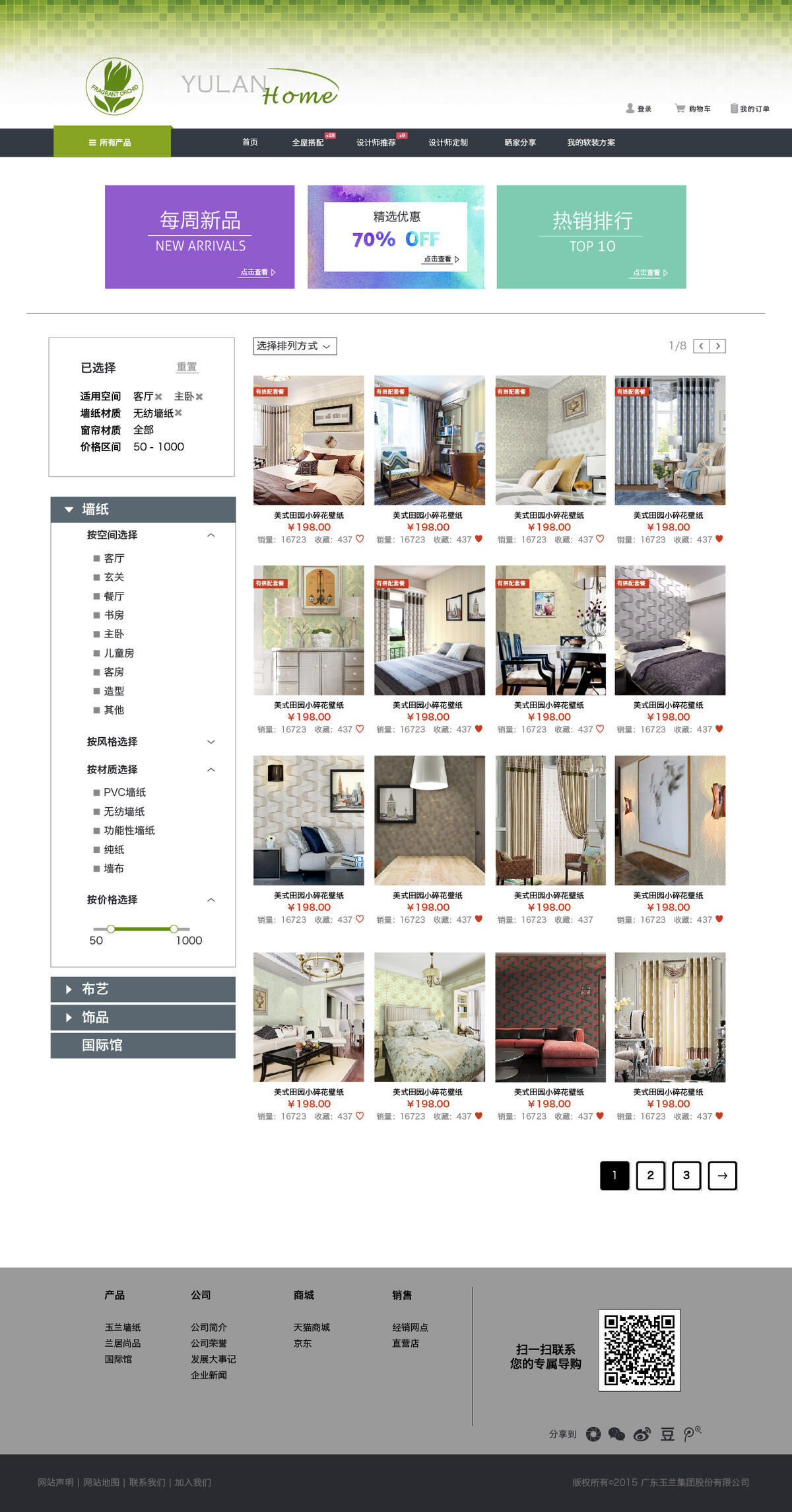
All products: a faceted filter rail for space, material and price with applied-filter chips and a reset, beside a sortable product grid showing price, sales count and favourites.
The catalogue proper — faceted by room, material and price, with what you have already chosen shown back to you.
Product detail: promotional price, sales and rating, colour variants, quantity with stock note, buy and cart buttons, a recommended bundle, and tabs for specification, reviews and service.
Product detail, with the bundle it belongs to offered inline rather than after checkout.
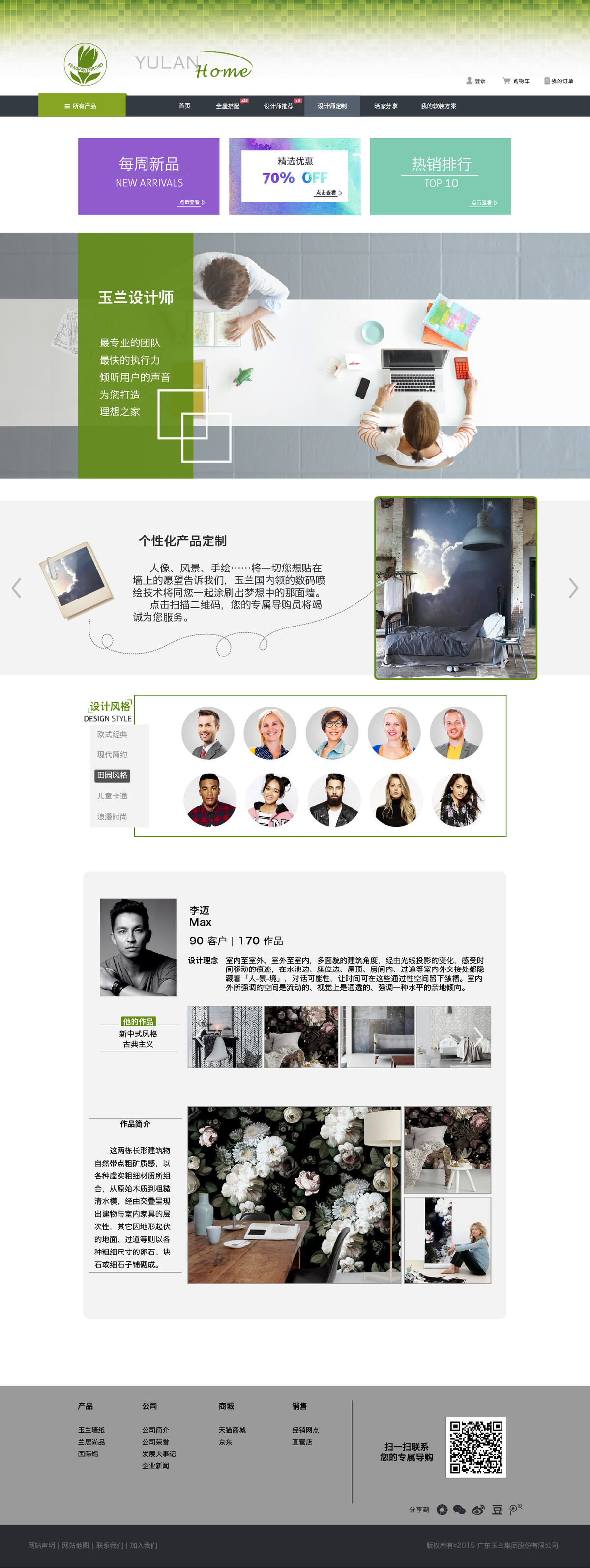
Designer customization: a team banner, personalized printing where a customer's own image goes on the wall, a design-style filter, and a designer profile with client and project counts.
Custom work — printing your own image onto the wall, and choosing the designer who does it.
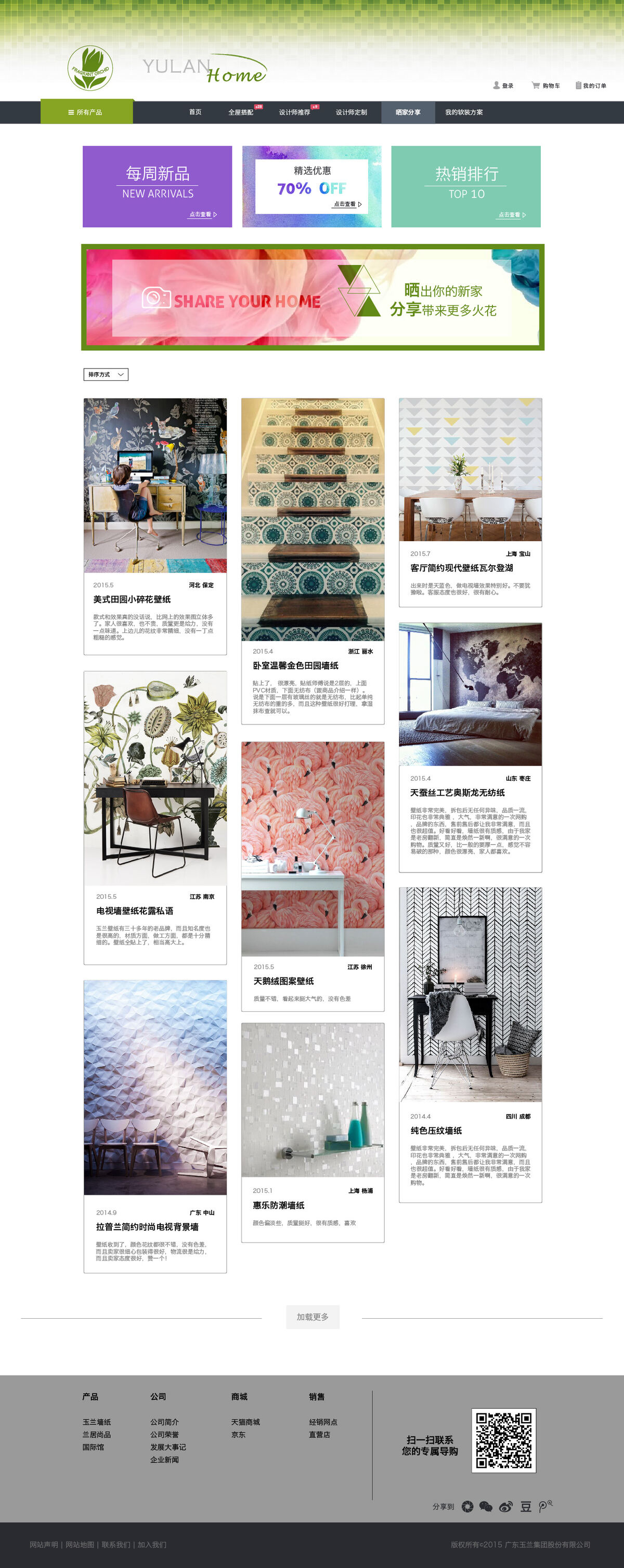
Share your home: a masonry feed of customer photographs, each captioned with date, city and the product used.
Customer photos, each tagged with the paper actually on that wall.
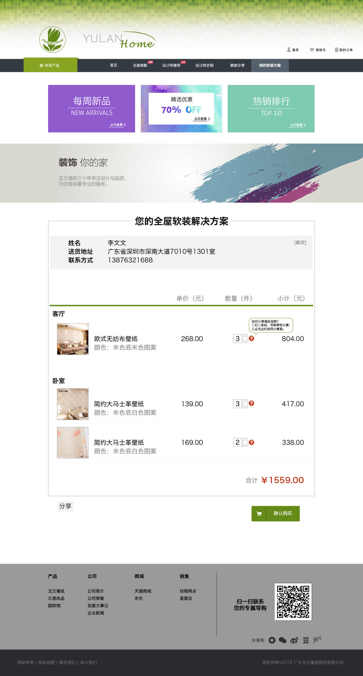
My plan: an order summary with delivery details, grouped by room, showing unit price, quantity and subtotal per item and a total.
The plan, grouped by room rather than as a flat basket.
Bundle deals: numbered combinations, each with a saving badge, the total against the bundle price, and the items included.
Bundles, with the saving stated against the sum of the parts.

What survives from proposal one is the room — it is how people actually shop for wallpaper, so it runs through the home page, the whole-home tool and even the basket. What survives from proposal three is that the service is stated rather than implied. The catalogue, the faceted filtering and the roll calculator on the product page are the part no proposal had, and the part the business actually needed.

Product UI · Voice interface

Voice-controlled home screen

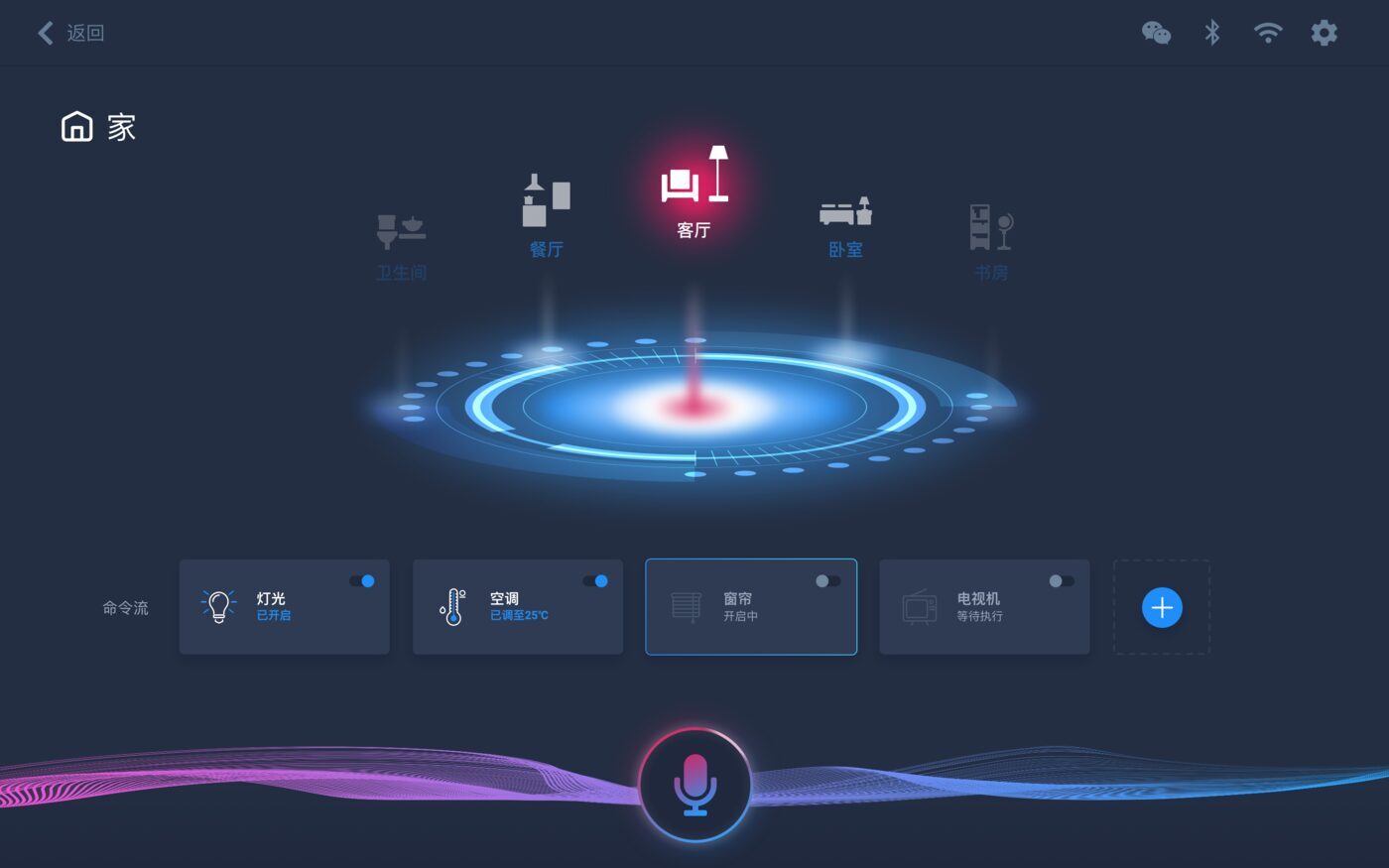
A screen for a voice assistant, where the display is the assistant's second channel rather than its main one. Rooms sit on a ring around the microphone, scenes are isometric places rather than lists of switches, and a waveform along the bottom edge shows the system listening without a modal taking over the screen.

Voice + screen Smart home Dark UI
Dark voice assistant home screen: rooms arranged around a glowing ring, device shortcuts below, microphone and waveform at the bottom.
Home.
Scene selection screen with isometric illustrations of a home and an office.
Scenes.

Product UI · Mobile web

Daily briefing subscription

A daily market briefing delivered as a mobile page: fundamentals, a forecast, and a deeper data section, designed in a subscriber and a non-subscriber version so the paywall is a change of state in one layout rather than a separate page. The free version has to be genuinely readable and still make the case for the paid one.


Mobile web Charts Subscription states
Full-length mobile page: subscriber version of the daily briefing with fundamentals, forecast chart and analysis.
Subscriber version.
Full-length mobile page: non-subscriber version with sections locked.
Non-subscriber version.
Full-length mobile article page.
Article page.

Full-length page designs — click any image to see the whole page.

E-commerce

ilk London

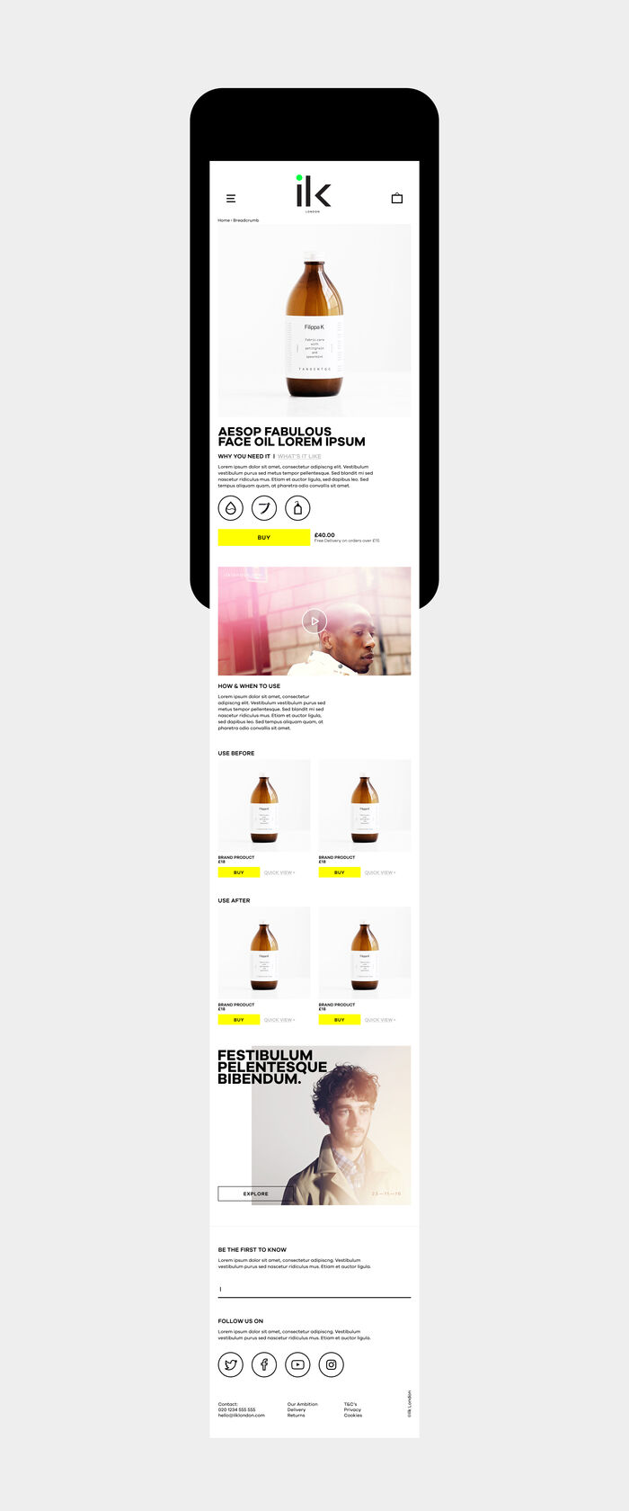
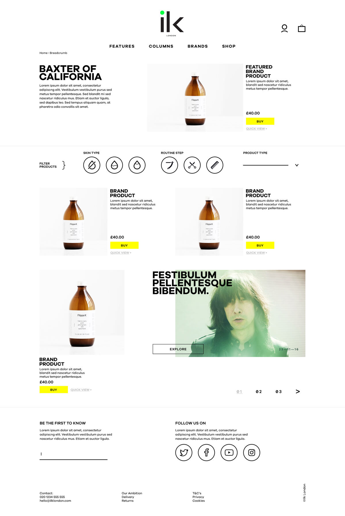
A men's grooming shop built on a hard editorial grid: heavy condensed type, a lot of white, one yellow that only ever means "buy". Product filtering is set as a row of line icons — skin type, routine step, product type — so a browse can be narrowed without opening a panel, and editorial blocks are cut into the product grid at full width to break the catalogue rhythm.
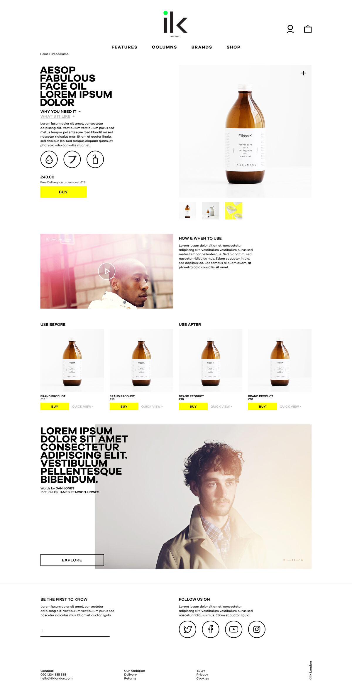
Web Mobile Editorial layout Print
Category page: brand header, filter icons, product grid with yellow buy buttons and an editorial block.
Category page.
Product page with large product image and specification blocks.
Product page.
The product page adapted to a phone screen.
Mobile.
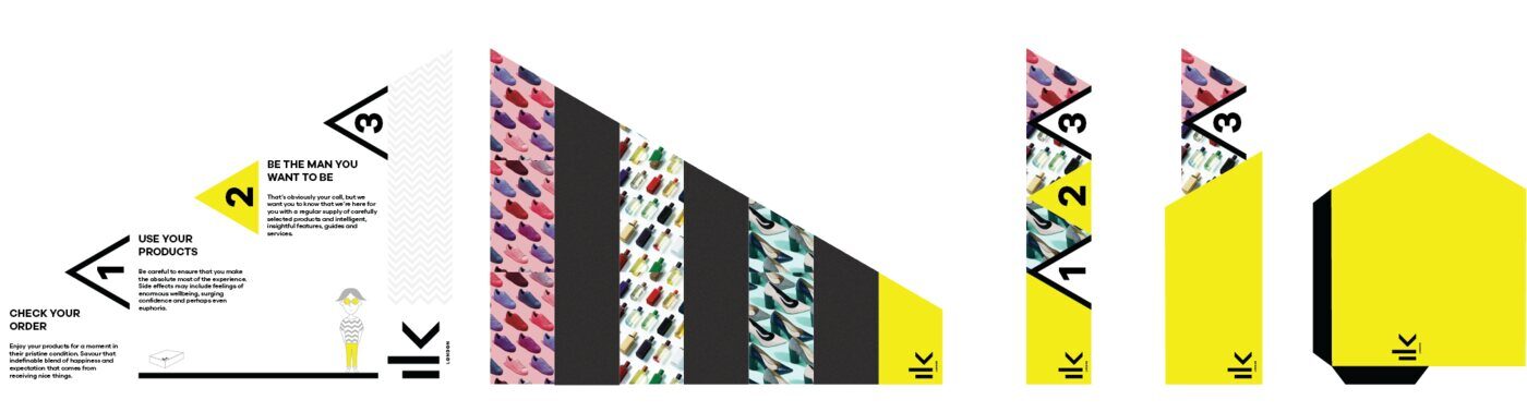
Folded leaflet design carrying the same typographic system.
Leaflet, on the same system.

Corporate site

Industrial group website

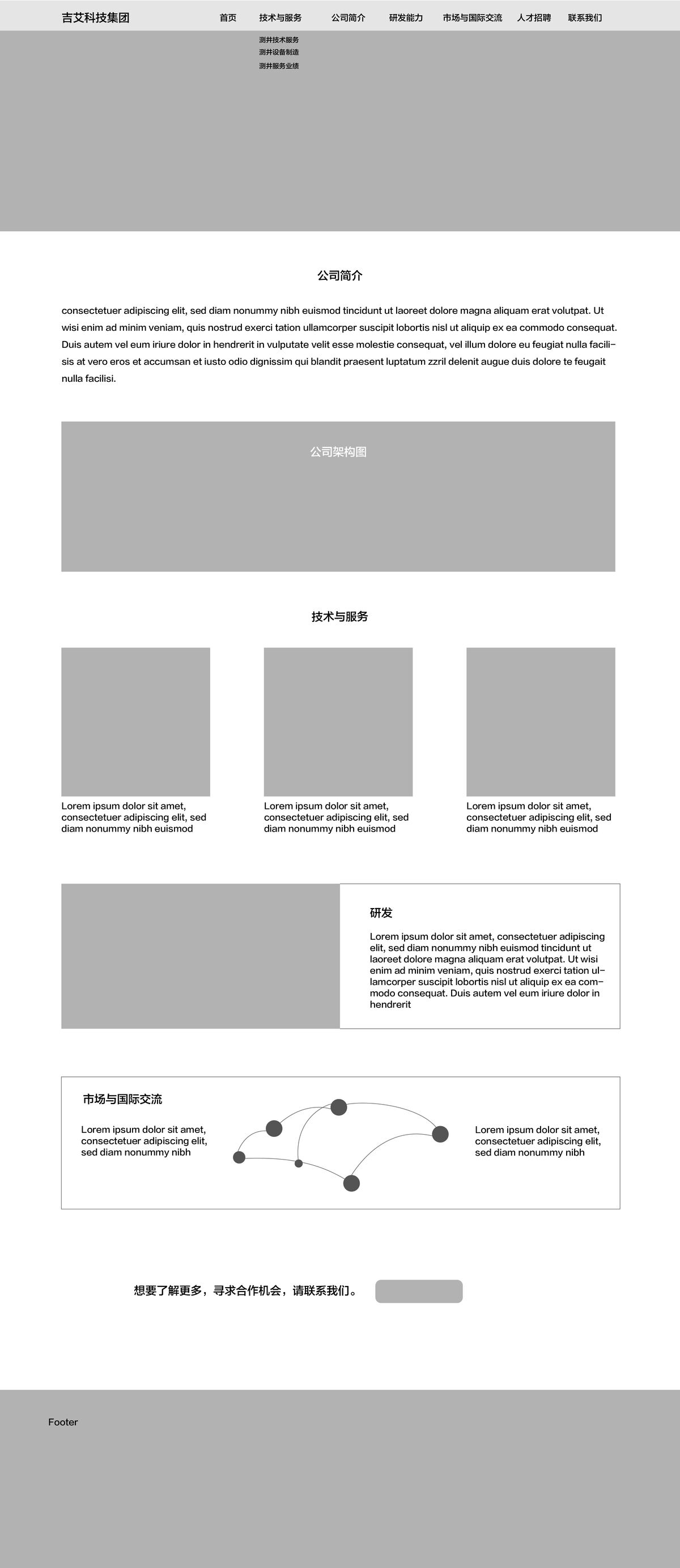
A corporate site for an oil-services and equipment group, with the problem most corporate sites have: several audiences, one homepage. The structure separates them — technology and services, group profile, R&D, markets, recruitment — and a diagram of the group's subsidiary structure does the work that three paragraphs of company history usually fails to do. Designed for desktop and phone.


Corporate web Information architecture Responsive
Full-length corporate homepage: photographic hero, company profile, subsidiary structure diagram, and technology and services cards.
Desktop home page.
Full-length mobile version of the corporate homepage.
Mobile.
Site framework diagram showing the page structure.
Site framework.

Brand

Identity marks

Logos for small businesses and non-profits — a bakery, a charity travel program, a charity shop, an elder-care service.


Circular bakery logo with a loaf of bread and a banner, in mint on dark navy.
Gradient logo of layered feather forms in pink, green and blue.
Shopping bag mark with a red heart, set beside a wordmark.
Logo combining a peach silhouette with a heart outline in orange and pink, above a wordmark.

Print & campaign

Posters and product graphics

A campaign poster for a summer program, a product presentation board, and product marketing graphics.


Summer camp poster: flat night-time illustration of a tent and cabin under a moon.
Summer camp poster.
Presentation board for an umbrella whose ink-style pattern appears in the rain, with a photographic hero and three product views.
Product presentation board.
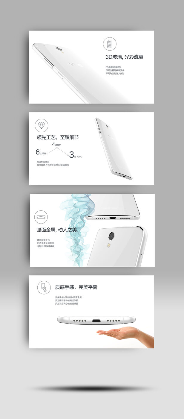
Phone marketing graphics: four stacked panels each pairing a product shot with a short feature line.
Product marketing graphics.

Contact

Get in touch

I am open to new work opportunities, including relocation.